A photography logo can look elegant at the top of a portfolio and become useless the moment it is placed over a bright sky, dark suit, detailed wedding dress, or 32-pixel browser tab. Thin signatures disappear. Detailed camera drawings turn into noise. A wide wordmark becomes unreadable on a square social profile.
The fastest fix is to design the logo as a small, one-color system first. Approve one compact mark and one horizontal lockup, test both over light and dark photographs, then add color. This guide shows how to use a photography logo maker without ending up with a beautiful preview that fails in real client work.
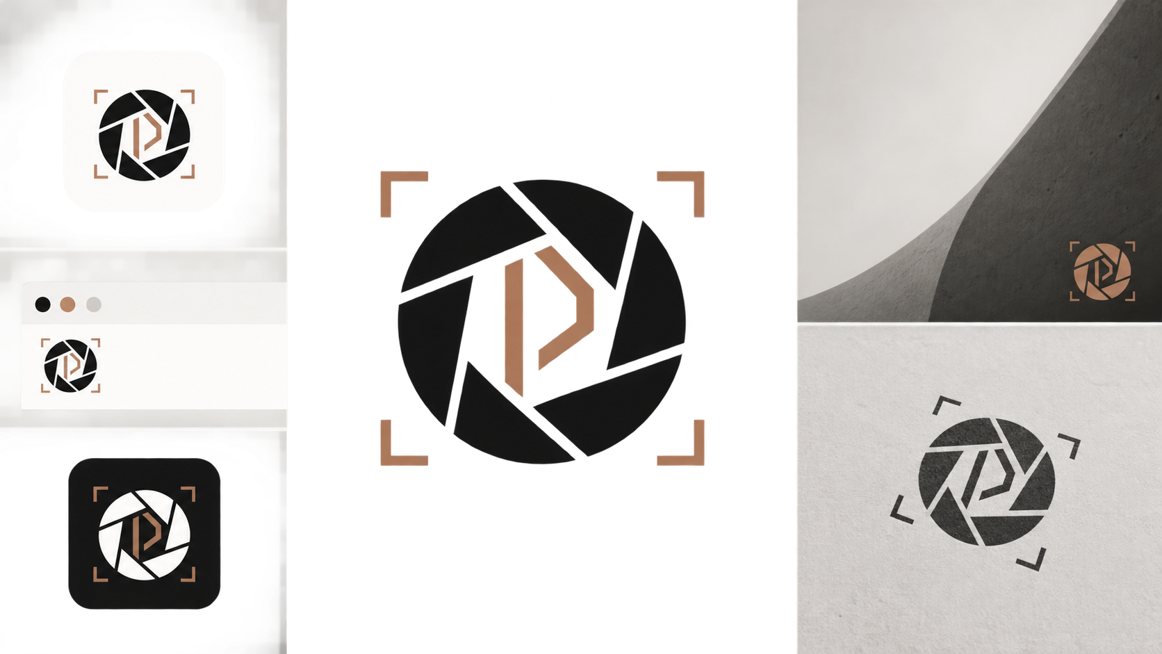
What makes a good photography logo?
A good photography logo has one memorable idea, readable typography, and variants built for different placements. It should remain recognizable as a tiny favicon, feel quiet over a finished photograph, fit a portfolio header, and reproduce cleanly in one color on packaging, albums, invoices, and print materials.
A photography logo is a visual identifier used to connect a photographer's images, website, social profiles, client documents, and physical products to the same business. It should support the photographs rather than compete with them.
Use this 30-second decision rule: turn the logo black, shrink it to 32 pixels, and place it over one bright image and one dark image. If the symbol closes up, the name disappears, or the mark needs a mockup to feel impressive, simplify it.
What is the fastest way to create a photography logo?
The fastest reliable workflow is to choose one business position, generate a few simple directions, reject anything that fails at small size, and refine only the strongest option. Starting in black and white reveals whether the logo works before color, texture, and presentation effects distract you.
- Name the photography niche: wedding, portrait, product, food, fashion, event, real estate, or commercial.
- Choose one desired impression: editorial, warm, cinematic, precise, playful, luxurious, or documentary.
- Select one logo structure: monogram, wordmark, symbol plus name, or compact badge.
- Generate four to eight concepts with one visual idea each.
- Reject concepts that fail at 32 pixels or become intrusive as a watermark.
- Build a compact mark and a horizontal lockup from the winning direction.
- Save an SVG master, then export light and dark transparent PNG versions.
Start in SVG Genie's logo maker, then adjust path geometry, spacing, color, or canvas size in the SVG editor. If you need a general production workflow first, the SVG logo maker guide covers concept selection, cleanup, and export.
Which photography logo style should you choose?
Choose the style that reinforces what clients are buying. A wedding photographer may need warmth and restraint, while an architectural photographer needs precision. The logo should signal the category without copying the same aperture icon used by every nearby competitor.
| Logo direction | Best for | Main strength | Common failure |
|---|---|---|---|
| Clean wordmark | Editorial, fashion, commercial | Keeps attention on the images | Generic without distinctive type details |
| Monogram | Personal-name studios | Compact for favicons and watermarks | Interlocked initials become illegible |
| Abstract aperture | General photography studios | Communicates the category quickly | Looks like stock camera clip art |
| Signature mark | Wedding and portrait brands | Feels personal and handcrafted | Thin strokes vanish over photographs |
| Frame or crop shape | Architecture, product, real estate | Suggests composition and precision | Can resemble a software icon |
| Badge | Outdoor, sports, film-inspired brands | Works well on merchandise | Too much text at small sizes |
If two directions feel equally strong, choose the one with fewer lines and a more distinctive silhouette. You can add personality through typography, spacing, and color without making the symbol more complicated.
How do you write a useful photography logo prompt?
A useful prompt specifies the photography niche, brand mood, logo structure, one visual idea, and the placements the result must survive. It should explicitly request flat vector shapes, transparent background, limited colors, and no mockup effects, tiny detail, fake camera text, or photorealistic equipment.
Use this formula:
Create a [brand mood] logo for a [photography niche] studio.
Use a [logo structure] built around one [visual idea].
Pair it with [type direction]. Palette: [two colors].
It must remain clear as a 32px favicon, subtle photo watermark,
portfolio header, square social avatar, and one-color print mark.
Flat vector shapes, transparent background, no gradients,
no tiny detail, no mockup, no photorealistic camera.
Example: “Create a quiet editorial logo for an architectural photography studio. Use a geometric monogram built from one crop-frame idea with a restrained sans-serif wordmark. Charcoal and muted copper. It must work as a favicon, watermark, portfolio header, social avatar, and one-color print mark.”
Generate variations by changing one variable at a time. Changing the symbol, typography, palette, and layout together makes it impossible to identify why one version works better. For more structures, use these AI logo prompt examples for clean SVG output.
Should a photographer use a camera or aperture symbol?
Use a camera or aperture only when immediate category recognition matters more than originality, and simplify it aggressively. Avoid literal camera bodies, lens reflections, shutter blades, film strips, and script initials combined into one mark. A familiar symbol needs a distinctive geometric decision to feel ownable.
An aperture can become more specific by forming an initial in negative space. A crop frame can echo the studio's preferred aspect ratio. A focus point can combine with a monogram. These moves still communicate photography without producing another interchangeable camera badge.
Before approval, compare the result with local competitors and perform an appropriate trademark search in every market where the business operates. AI generation and visual novelty do not establish legal availability.
How should a photography logo work as a watermark?
A watermark logo should identify the photographer without becoming the subject of the image. Use a simplified mark, remove taglines, keep enough stroke weight to survive resizing, and prepare separate light and dark versions. Test it over faces, skies, clothing, foliage, and high-detail backgrounds.
| Watermark problem | Likely cause | Fast fix |
|---|---|---|
| Disappears over bright areas | Only a white version exists | Use a dark variant or subtle contrasting outline |
| Vanishes after social compression | Strokes are too thin | Increase stroke weight or use filled shapes |
| Covers important image detail | Full horizontal logo is too large | Use the compact symbol or monogram |
| Feels distracting | Excessive size, opacity, or detail | Reduce the mark and simplify its silhouette |
| Looks blurry on exports | Small raster source was enlarged | Export a correctly sized PNG from the SVG master |
| Name becomes unreadable | Script or tracking is too delicate | Use a sturdier secondary watermark lockup |
Start around 20 to 35 percent opacity when the watermark is meant to be discreet, but treat that as a test range rather than a rule. A light image may need a darker mark; a busy image may need a quiet solid backing or a different corner. Never rely on one fixed setting for every photograph.
Which logo variants does a photographer need?
Most photographers need two layouts and four color treatments, not dozens of unrelated logos. Build one horizontal lockup for the website and documents, one compact mark for square and tiny placements, then prepare full-color, black, white, and restrained watermark versions from the same geometry.
- Horizontal SVG for the portfolio header and client documents.
- Compact SVG for the favicon, social avatar, and gallery icon.
- Black one-color SVG for stamps, forms, and simple print.
- White one-color SVG for dark backgrounds.
- Dark transparent PNG watermark at practical export sizes.
- Light transparent PNG watermark at the same sizes.
- A version without the tagline for small placements.
- A documented clear-space rule so the mark is not crowded.
Do not redraw the symbol for every channel. The responsive SVG logo variants guide explains how to adapt one identity across horizontal, compact, favicon, and dark-mode placements without losing recognition.
Why should the master photography logo be SVG?
SVG is the best master for a shape-based photography logo because its paths stay sharp at every size and remain easy to recolor, resize, and export. It can supply a tiny website mark, a large studio sign, and correctly sized transparent PNG watermarks without rebuilding the artwork.
MDN describes SVG as a vector image format for two-dimensional graphics. That does not mean the portfolio photographs should become SVG files; keep photographic images in suitable raster formats. Use SVG for the logo's shapes and type, then export PNG copies when a platform or editing workflow requires raster assets.
| File | Keep it for |
|---|---|
| SVG | Editable master, website, signs, scalable production |
| Transparent PNG | Photo watermarks, social profiles, raster-only apps |
| PDF or EPS | Vendors that specifically request a production format |
| JPG | Preview sheets only; not a transparent logo master |
If the only available logo is a small JPG or PNG, try Image to SVG for a simple high-contrast mark. Rebuild damaged lettering and intricate signature strokes instead of trusting a rough automatic trace. The logo file-format guide explains what belongs in the final handoff folder.
Why does a photography logo fail in a portfolio header or favicon?
Portfolio headers fail when a wide wordmark demands too much space or thin type loses contrast against the page. Favicons fail when the complete studio name is squeezed into a tiny square. These are layout problems, not reasons to invent a second identity.
Use the horizontal lockup in the site header and the compact mark in the favicon. Give both deliberate clear space. Test the header on narrow mobile screens, and inspect the favicon at its actual rendered size rather than zooming into it in a design tool.
A strong compact mark should remain identifiable without the studio name. If it cannot, simplify the geometry before adding more detail. The website logo size guide provides practical sizing and export checks for headers, retina displays, social profiles, and print.
What should you do before approving the logo?
Approve the logo only after it survives realistic placements, not because it looks polished on an empty presentation board. Test the exact files in the photographer's portfolio, editing workflow, social profile, client PDF, watermark preset, and one physical application before treating the identity as finished.
Run this final check:
- The symbol is recognizable at 32 pixels.
- The name is readable in the mobile portfolio header.
- The light and dark watermarks work over varied photographs.
- The mark still works in solid black.
- The SVG contains editable paths or shapes, not an embedded bitmap.
- The compact and horizontal versions clearly belong together.
- No tagline or fine line is required for recognition.
- The design is meaningfully different from direct competitors.
- The SVG, PNG exports, and color values are stored together.
Then open SVG Genie's logo maker, generate a few one-idea directions, and eliminate anything that fails the small-size and watermark tests. Refine the winner in the SVG editor, keep SVG as the master, and export only the light and dark PNG copies your workflow actually needs.
Frequently asked questions
What makes a good photography logo?
A good photography logo is distinctive without being complicated. It uses one clear idea, readable type, a strong silhouette, and enough contrast to work as a small watermark, favicon, social avatar, portfolio header, and one-color print mark.
Should a photography logo include a camera?
Not necessarily. A camera or aperture can communicate photography quickly, but a monogram, signature, frame, light-inspired shape, or abstract mark may be more distinctive. Choose the simplest symbol that fits the photographer's positioning.
What is the best file format for a photography logo?
Keep an SVG as the editable master because it scales cleanly and makes color changes easy. Export transparent PNG versions for photo watermarks and platforms that do not accept SVG, plus a one-color variant for print.
How opaque should a photography watermark be?
There is no universal percentage because every image has different contrast. Start around 20 to 35 percent opacity for a subtle portfolio watermark, then test it over both light and dark photographs. Use a solid, higher-contrast mark when attribution must remain obvious.
Create your own SVG graphics with AI
Describe what you need, get a production-ready vector in seconds. No design skills required.
About This Article
This article was written by SVG Genie Team based on hands-on testing with SVG Genie’s tools and years of experience in vector design and web graphics. All recommendations reflect real-world usage and are reviewed by the SVG Genie editorial team for accuracy.
About the Author
SVG Genie Team
SVG Design Expert & Technical Writer at SVG Genie
SVG Genie Team is a vector design specialist and technical writer at SVG Genie with years of hands-on experience in SVG tooling, AI-assisted design workflows, and web graphics optimization. Their work focuses on making professional vector design accessible to everyone.
More articles by SVG Genie Teamarrow_forward