A monogram can look elegant at presentation size and become an unreadable knot in a browser tab. The problem is rarely the initials themselves. It is usually too many overlaps, inconsistent stroke weights, or a logo maker that exports a flattened image instead of a clean vector.
The fastest fix is to choose one letter relationship, build the mark in one color first, and test it at 32 pixels before polishing anything. This guide shows how to turn two or three initials into an editable SVG logo without spending hours untangling decorative paths.
What is a monogram logo?
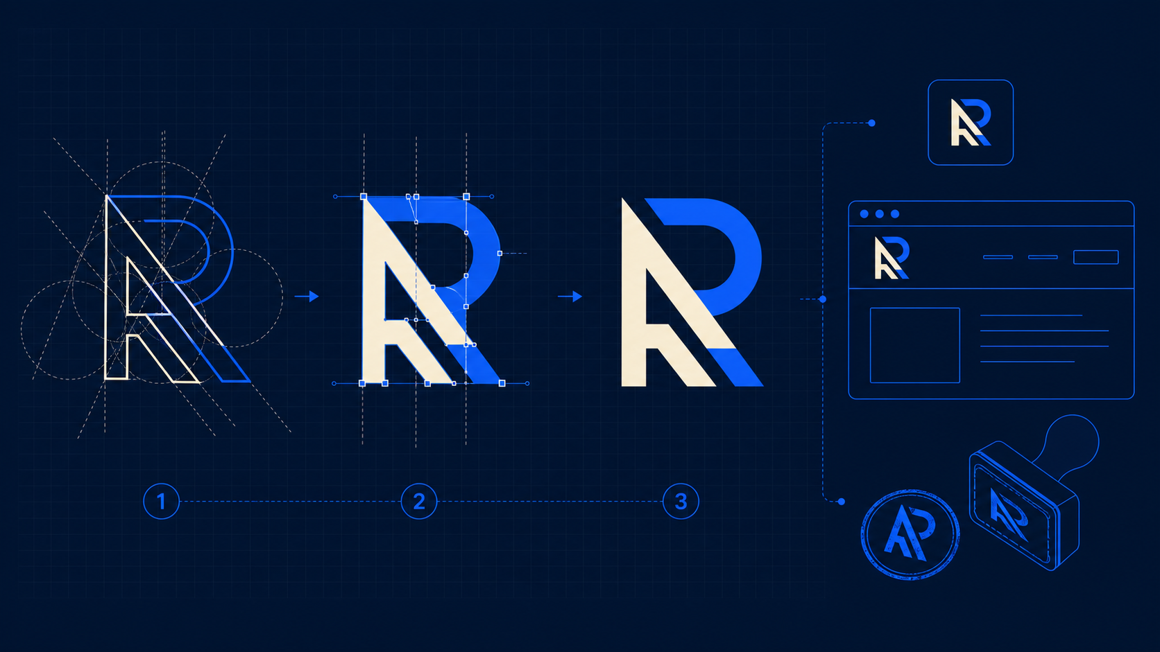
A monogram logo is a compact mark made by combining two or more initials into one recognizable symbol. The letters can overlap, interlock, share a stroke, mirror each other, or sit inside a simple shape. A successful monogram reads as both lettering and a unified icon.
Monograms are useful when a full business name is too long for an avatar, product stamp, favicon, or small website header. They are especially common for personal brands, professional services, fashion labels, hospitality businesses, wedding brands, and companies whose initials already sound familiar.
Monogram logo design is the process of reducing initials into a distinctive, repeatable symbol. It is not just typing two letters and moving them closer together. The design has to control hierarchy, spacing, silhouette, and small-size legibility.
If your business name matters more than its initials, start with a wordmark or combination logo instead. A monogram works best when people can learn the initials quickly or when the mark will usually appear beside the full name.
What is the fastest way to create a monogram logo?
The fastest method is to make four black-and-white arrangements, reject any that fail at thumbnail size, and refine only the strongest one. Start with a clean typeface, avoid effects, and do not choose colors until the letter structure works.
Use this seven-step workflow:
- Write the initials in uppercase, lowercase, and mixed case.
- Pick one construction: side-by-side, overlap, shared stroke, stacked, or enclosed.
- Create four rough black versions.
- Shrink each version to 32 pixels.
- Keep the version whose letters and overall shape remain clearest.
- Convert the approved lettering to vector paths and adjust spacing.
- Export an SVG master plus PNG copies for everyday use.
You can build the starting mark in SVG Genie's logo maker, then inspect and refine the paths in the SVG editor. If you already have a sketch or raster concept, use Image to SVG and simplify the trace before treating it as a logo master.
This workflow reduces wasted effort because it tests the hard constraint early. A monogram that fails in one color at 32 pixels will not be rescued by a gradient, mockup, or expensive font.
Which monogram structure should you choose?
Choose the simplest structure that makes both initials recognizable. Side-by-side letters are the safest; shared-stroke and interlocking designs feel more distinctive but demand careful spacing. Stacked and enclosed monograms fit square placements well, while mirrored designs only work with compatible letter shapes.
| Structure | Best for | Main advantage | Common failure |
|---|---|---|---|
| Side-by-side | Professional services, personal brands | Maximum readability | Looks like ordinary typed initials |
| Overlapping | Fashion, beauty, hospitality | Compact and expressive | Creates dark, muddy intersections |
| Shared stroke | Tech, architecture, modern brands | Feels custom with few shapes | One letter becomes hard to identify |
| Stacked | Avatars, stamps, app icons | Naturally square composition | Reading order becomes unclear |
| Enclosed | Badges, makers, restaurants | Strong outer silhouette | Container overwhelms the letters |
| Mirrored | Initial pairs with similar geometry | Symmetrical and memorable | Forced symmetry distorts a letter |
Start side-by-side if you are unsure. Move one letter toward the other until a useful relationship appears. Do not force an overlap simply because monograms are expected to interlock.
For three initials, give one letter a clear role. A surname initial can be larger, centered, or used as the structural frame. Giving all three letters equal visual weight often produces a dense cipher rather than a logo.
How do you make overlapping initials readable?
Keep overlapping initials readable by preserving open counters, limiting intersections, and creating visible negative space between important strokes. If two dark strokes cross, remove or offset one segment so the eye can follow each letter without decoding a solid block.
Use this quick overlap test:
- Fill the entire mark with black.
- View it at 100%, 25%, and favicon size.
- Check whether enclosed spaces in letters such as A, B, D, O, P, and R remain open.
- Check whether each initial can be traced with your eye.
- Remove decorative strokes that do not help identification.
- Increase spacing before making strokes thinner.
Negative space is often the cleanest solution. Instead of placing one solid letter on another, cut a narrow gap where the strokes cross. That preserves both forms and usually reproduces more reliably in print, embroidery, laser engraving, and vinyl cutting.
If the generated concept has hundreds of fragments, it is faster to rebuild the main strokes than to repair every trace. The SVG cleanup checklist explains how to remove unnecessary groups and shapes without changing the artwork.
Which fonts work best for monogram logos?
Fonts with clear letter anatomy and consistent strokes make the best starting point. Geometric sans serifs create modern monograms, high-contrast serifs feel editorial or luxurious, and restrained humanist faces feel approachable. Decorative scripts are harder to combine and usually fail sooner at small sizes.
The font is a starting scaffold, not the finished identity. Once you choose a direction, convert the letters to paths and customize a few meaningful details: a shared diagonal, a shortened crossbar, a matched curve, or a deliberate corner treatment.
Avoid these traps:
- Using a script font with hairline strokes for a favicon.
- Combining two unrelated typefaces inside one tiny mark.
- Stretching letters non-proportionally to force them into a box.
- Leaving kerning untouched after the letters overlap.
- Using a font without checking its commercial license.
Keep the original font name and license in your project notes. Converting text to paths does not erase the font's license terms.
Why should a monogram logo be exported as SVG?
SVG keeps a monogram sharp from favicon size to storefront signage because it describes vector shapes rather than a fixed pixel grid. It also makes colors, paths, spacing, and canvas dimensions easier to edit after the first export.
MDN defines SVG as an XML-based format for two-dimensional vector graphics. For a monogram, that means the master file can contain actual paths and shapes instead of a blurry bitmap placed inside a vector wrapper.
A usable SVG monogram should have:
- A correct
viewBoxwith intentional padding. - Vector paths rather than an embedded PNG or JPEG.
- A transparent background unless a badge shape is part of the logo.
- Consistent fill and stroke values.
- No hidden objects, editor metadata, or remote references.
- Outlined lettering when the recipient may not have the font.
SVG should be your master, not your only deliverable. Export transparent PNGs for social profiles and software that rejects SVG. Keep a one-color version for stamps and constrained production. The responsive SVG logo variants guide covers the header, favicon, dark-mode, and app-icon versions worth preparing.
How do you check whether an SVG monogram is production-ready?
A production-ready monogram remains recognizable in one color, survives at 16 to 32 pixels, contains editable vector paths, and has a clean canvas. It should work on light and dark backgrounds without relying on shadows, texture, or a mockup.
Run this approval checklist:
- Both initials are recognizable without an explanation.
- The silhouette is distinct from common template marks.
- The logo works in solid black.
- Important gaps remain open at 16px and 32px.
- Stroke weights feel balanced at intersections.
- The SVG uses a correct
viewBoxand does not crop. - The file contains paths or shapes, not only an embedded bitmap.
- The background is transparent.
- The color palette uses exact saved values.
- The mark works on white, black, and the primary brand color.
- Font licensing has been checked.
- A simplified icon variant exists if the main mark fails at favicon size.
Open the SVG in a browser as well as your design tool. Browser testing catches missing fonts, broken masks, unsupported effects, and canvas problems that a single editor may hide.
Why does a monogram logo look blurry or cropped online?
A monogram usually looks blurry because the site is using a small PNG and enlarging it. Cropping usually comes from a bad SVG viewBox, artwork touching the canvas edge, or a container using a cover-style crop. Replace enlarged bitmaps with SVG and add deliberate breathing room around the mark.
Check these failure modes in order:
| Symptom | Likely cause | Fast fix |
|---|---|---|
| Blurry at large size | Small raster export | Use the SVG master |
| Cut off at edges | Tight or incorrect viewBox | Expand the SVG canvas |
| Tiny inside header | Excess transparent canvas | Trim unused canvas space |
| Different font on another device | Live text depends on missing font | Convert approved text to paths |
| Dark block behind logo | White rectangle was traced | Remove the background shape |
| Fine gaps disappear | Intersections are too tight | Enlarge negative spaces |
For a canvas-specific diagnosis, follow the Figma SVG viewBox fix. If the source is a low-resolution raster logo, the low-resolution logo to SVG guide explains when tracing will work and when rebuilding is cleaner.
What files should a monogram logo package include?
A practical monogram package needs an editable SVG master, a one-color SVG, a reversed SVG for dark backgrounds, a favicon-ready SVG, and transparent PNG exports. Naming files by purpose prevents the wrong version from reaching a website, printer, or social profile.
Use a simple structure:
brand/
  monogram-primary.svg
  monogram-one-color.svg
  monogram-reversed.svg
  monogram-favicon.svg
  monogram-512.png
  monogram-192.png
  monogram-32.png
Do not create dozens of arbitrary sizes before the master is approved. First lock the geometry and colors. Then derive every variant from that source so the initials do not drift between applications.
How do you make your monogram less generic?
Make a monogram less generic by connecting one structural detail to the brand: a relevant angle, opening, rhythm, or silhouette. The distinguishing idea should still work in one color and should not require a paragraph of symbolism to understand.
Good customization is restrained. A construction company might use a stable shared baseline. A music brand could use repeated vertical rhythm. A hospitality mark may use a softer enclosed shape. The goal is not to hide five metaphors inside two letters; it is to make one visual decision feel owned.
Before approval, compare the mark against logos in the same category and run a basic trademark search in the countries where you operate. A generated mark can still resemble an existing identity. Visual originality and legal clearance are separate jobs.
What is the best next step for your initials?
Start with two initials, four black-and-white arrangements, and one 32-pixel test. Choose the clearest structure before adding color. Then create the mark in the SVG logo maker, refine it in the SVG editor, and save an SVG master before exporting PNG variants.
The rule is simple: if the monogram is clear when small, one-color, and unstyled, you have a useful foundation. If it only works inside a glossy mockup, simplify it before you ship.
Frequently asked questions
What is a monogram logo?
A monogram logo combines two or more initials into one recognizable mark. The letters may overlap, interlock, share strokes, or sit inside a simple container, but they should remain identifiable and work as one compact visual symbol.
What is the best format for a monogram logo?
SVG is the best master format for most monogram logos because it stays sharp at any size and keeps shapes editable. Export PNG copies for platforms that do not accept SVG, and PDF or EPS only when a printer specifically requests them.
How many letters should a monogram logo use?
Two letters are the easiest to balance and recognize. Three can work when the middle or surname initial has a clear hierarchy. Four-letter monograms usually need aggressive simplification or a wordmark will be more readable.
How do I make a monogram logo readable at small sizes?
Use a simple silhouette, remove thin strokes, enlarge the gaps between overlapping letters, avoid more than two colors, and test the mark at 16, 32, and 64 pixels. If the initials merge into a blob at 16 pixels, create a simplified favicon variant.
Create your own SVG graphics with AI
Describe what you need, get a production-ready vector in seconds. No design skills required.
About This Article
This article was written by SVG Genie Team based on hands-on testing with SVG Genie’s tools and years of experience in vector design and web graphics. All recommendations reflect real-world usage and are reviewed by the SVG Genie editorial team for accuracy.
About the Author
SVG Genie Team
SVG Design Expert & Technical Writer at SVG Genie
SVG Genie Team is a vector design specialist and technical writer at SVG Genie with years of hands-on experience in SVG tooling, AI-assisted design workflows, and web graphics optimization. Their work focuses on making professional vector design accessible to everyone.
More articles by SVG Genie Teamarrow_forward