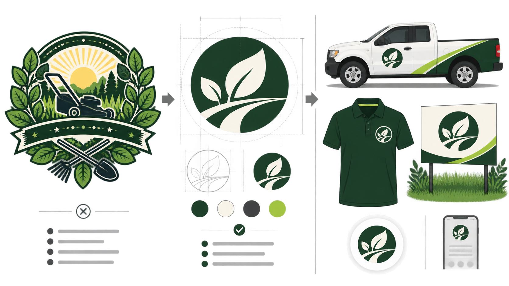
A landscaping logo can look polished on a large mockup and become a green blur on a truck door, embroidered polo, or small Google Business profile. The usual cause is predictable: too many leaves, tools, sun rays, textures, and words packed into one mark.
The fastest route to a usable result is to choose one recognizable idea, test it in solid black, and approve it at both 32 pixels and vehicle size before adding color. This guide shows how to use a landscaping logo maker to create a distinctive mark and a clean SVG file your team can use everywhere.
What makes a good landscaping logo?
A good landscaping logo is recognizable in a second, readable from the road, and simple enough for embroidery, cut vinyl, invoices, signs, websites, and social profiles. It needs one strong visual idea, controlled detail, clear contrast, and a vector master that remains sharp at every size.
A landscaping logo is a visual identifier for a lawn, garden, hardscape, or outdoor-design business across physical and digital applications. Its purpose is fast recognition—not to illustrate every service the company offers.
Use this decision rule: turn the logo black, shrink it to a profile icon, and imagine it passing on a work truck. If the name or central shape disappears, simplify it before refining anything else.
What is the fastest way to make a landscaping logo?
The fastest workflow is to define the primary service and desired impression, generate several one-symbol concepts, reject weak silhouettes, and refine only the strongest direction. Beginning in black and white prevents attractive colors and mockups from hiding a structurally weak logo.
- Name the core service: lawn care, landscape design, maintenance, tree care, irrigation, or hardscaping.
- Choose one brand trait: dependable, precise, premium, natural, established, or fast.
- Generate four concepts using one symbol family at a time.
- Compare every concept in solid black at 32 pixels.
- Keep the clearest silhouette and remove unnecessary detail.
- Pair it with sturdy, readable lettering.
- Export an SVG master plus practical PNG versions.
Start with SVG Genie's logo maker, then correct paths, colors, spacing, or canvas size in the SVG editor. If you need a broader process first, use the SVG logo maker guide to move from concept to editable master.
Which landscaping logo style should you choose?
Choose a logo style based on the work customers actually hire you to perform. Organic symbols suit garden-focused services, bold monograms travel well across multi-service fleets, and geometric landforms can position design-build firms as more architectural and premium.
| Logo direction | Best for | Strength | Common failure |
|---|---|---|---|
| Leaf or sprout | Lawn care and garden maintenance | Immediate natural cue | Looks like generic eco clip art |
| Tree silhouette | Arborists and established local firms | Strong, familiar shape | Fine branches disappear at small sizes |
| Path or contour line | Landscape designers | Suggests planned outdoor space | Becomes abstract without clear lettering |
| Stone or retaining-wall geometry | Hardscape contractors | Feels constructed and durable | Can resemble a builder or masonry logo |
| Monogram | Multi-service landscaping companies | Distinctive and scalable | Initials become tangled or unreadable |
| Badge | Long-running local operators | Communicates heritage and authority | Too much text around the edge |
Do not choose a leaf simply because competitors use one. A customized letterform, negative-space path, or simplified topographic line can be easier to own and recognize.
How do you write a useful landscaping logo prompt?
A useful landscaping logo prompt names the service, one visual idea, the intended personality, a limited palette, and the real placements the logo must survive. It should reject tiny detail, multiple competing symbols, gradients, and presentation effects that cannot be reproduced.
Use this formula:
Create a [personality] logo for a [specific landscaping business].
Use one [symbol or geometric idea] with [lettering style].
Palette: [dominant color] and [supporting color].
It must remain clear on a work truck, embroidered polo, yard sign,
invoice, website header, and 32px profile icon. Flat vector shapes,
transparent background, no gradients, no fine detail, no mockup.
Example: “Create a precise, premium logo for a residential landscape-design company. Use one geometric garden-path symbol with a confident sans-serif wordmark. Deep forest green and warm cream. It must work on trucks, polos, yard signs, invoices, and a 32px icon.”
Change one variable at a time. If you replace the symbol, type, palette, and layout simultaneously, you will not know which choice made the concept better. The AI logo prompt examples provide more patterns for clean vector output.
Which landscaping logo symbols should you avoid?
Avoid crowded symbol combinations and imagery that misrepresents the work. A mower, leaf, tree, sun, house, shovel, and water drop do not communicate a complete service; together they create visual noise that breaks on real production surfaces.
Watch for these failure modes:
- A stock leaf that could belong to a spa, farm, or cleaning company.
- Detailed trees whose branches close up in embroidery.
- Lawn stripes drawn with lines too thin for cut vinyl.
- A mower illustration that makes a design-build firm look lawn-care-only.
- Script lettering that cannot be read from a moving vehicle.
- Several similar greens with too little contrast.
- Gradients required to separate overlapping shapes.
If a familiar symbol is useful, customize its geometry. Turn a path into an initial, use negative space to suggest a leaf, or build a land contour into a monogram. One distinctive move is more memorable than five literal icons.
How should you test a landscaping company logo?
Test the logo where customers and crews will encounter it, not only on a presentation canvas. At minimum, check a truck door, embroidered polo, yard sign, invoice header, website navigation, social profile, and one-color reproduction before approving it.
- The business name is readable from a realistic roadside distance.
- The central symbol is recognizable at 32 pixels.
- The mark works in solid black without effects.
- Thin strokes and gaps survive embroidery.
- The colors remain visible on white and dark-green surfaces.
- A horizontal version fits a website header and vehicle door.
- A compact version fits a square profile image.
- The SVG contains vector shapes, not an embedded bitmap.
- The canvas has deliberate padding and does not crop artwork.
- The design is visibly different from nearby competitors.
Create a primary horizontal logo and a compact symbol rather than forcing one lockup into every placement. The responsive SVG logo variants guide explains how to keep variants visually consistent.
Why is SVG the best master file for a landscaping logo?
SVG is the best master format because vector shapes remain sharp from a tiny website icon to a large truck graphic or yard sign. Paths, colors, and spacing remain editable, so vendors can resize the artwork without rebuilding a pixelated image.
MDN defines SVG as an XML-based format for two-dimensional vector graphics. A useful logo SVG should contain real paths and shapes rather than a JPEG or PNG hidden inside an SVG wrapper.
| File | Best use |
|---|---|
| Primary SVG | Editable master for websites, signs, and vehicles |
| One-color SVG | Embroidery, stamps, vinyl, and economical printing |
| Reversed SVG | Dark trucks, shirts, and backgrounds |
| Transparent PNG | Social profiles and software without SVG support |
| PDF or EPS | Production vendors that specifically request it |
If the current logo exists only as a small image, try Image to SVG and use the low-resolution logo conversion guide. Simple flat marks may trace cleanly; damaged lettering and tiny details are usually better rebuilt.
Why does a landscaping logo fail on trucks, shirts, or signs?
Vehicle logos fail when lettering is too thin, the layout is too wide, or colors disappear against the truck. Embroidery fails when strokes and gaps are smaller than thread can preserve. Yard signs fail when secondary text competes with the company name and contact information.
| Symptom | Likely cause | Fast fix |
|---|---|---|
| Name vanishes from the road | Thin or compressed lettering | Use heavier type and a shorter lockup |
| Mark disappears on green fabric | Insufficient contrast | Create a cream or white reversed version |
| Embroidery fills in | Tiny gaps or leaf veins | Simplify shapes and enlarge openings |
| Yard sign feels crowded | Too many services in the logo | Move service details outside the core mark |
| Truck graphic looks blurry | Enlarged raster artwork | Supply the SVG master |
| Profile icon is illegible | Full wordmark forced into a square | Use a compact symbol variant |
Ask the production vendor for actual minimum sizes before final export. Embroidery, cut vinyl, screen printing, and digital display preserve detail differently.
How do you make a landscaping logo look premium instead of generic?
A premium landscaping logo uses disciplined geometry, restrained color, consistent lettering, and intentional space—not more decoration. Choose one outdoor idea, refine its proportions, and use the same approved files and colors at every customer touchpoint.
Consistency creates recognition. Put the same primary mark on estimates, trucks, crew clothing, yard signs, project photos, and the website. Do not use a tree badge on the truck, a random leaf online, and an unrelated monogram on social media.
Before committing to an AI-generated direction, compare it with local competitors and perform an appropriate trademark search in every market where you operate. Generation does not guarantee that a concept is unique or legally available.
What should you do next?
Write down your primary service and one desired brand trait, generate four one-symbol concepts, and reject anything that fails in black at small size. Build the strongest direction in the landscaping logo maker, clean it in the SVG editor, and test it on a truck, polo, yard sign, website header, and profile icon before production.
The goal is not the logo with the most landscaping imagery. It is the mark customers recognize quickly and your team can reproduce without repairing the file every time.
Frequently asked questions
What makes a good landscaping logo?
A good landscaping logo has one recognizable idea, a strong silhouette, readable lettering, and enough contrast to work on trucks, uniforms, yard signs, invoices, websites, and small social icons. It should also remain clear in one color.
What colors work best for a landscaping logo?
Deep green, charcoal, cream, earth brown, and restrained yellow-green accents are practical choices. Avoid relying on several similar greens; the logo needs enough contrast to remain legible on vehicles, clothing, and signs.
Should a landscaping logo include a leaf or tree?
Only if the symbol is distinctive and matches the service. A leaf may fit garden care, while a path, contour line, monogram, or geometric outdoor shape can better distinguish a full-service landscaping company.
What file format should a landscaping company use for its logo?
Keep SVG as the editable master because it scales cleanly for vehicles and signs. Export transparent PNG files for social profiles and office software, plus PDF or EPS only when a printer or production vendor requests one.
Create your own SVG graphics with AI
Describe what you need, get a production-ready vector in seconds. No design skills required.
About This Article
This article was written by SVG Genie Team based on hands-on testing with SVG Genie’s tools and years of experience in vector design and web graphics. All recommendations reflect real-world usage and are reviewed by the SVG Genie editorial team for accuracy.
About the Author
SVG Genie Team
SVG Design Expert & Technical Writer at SVG Genie
SVG Genie Team is a vector design specialist and technical writer at SVG Genie with years of hands-on experience in SVG tooling, AI-assisted design workflows, and web graphics optimization. Their work focuses on making professional vector design accessible to everyone.
More articles by SVG Genie Teamarrow_forward