One logo file rarely works everywhere. The horizontal mark that looks polished in a desktop header becomes unreadable in a browser tab, cramped in a mobile navbar, invisible on a dark background, and awkward when cropped into a social avatar.
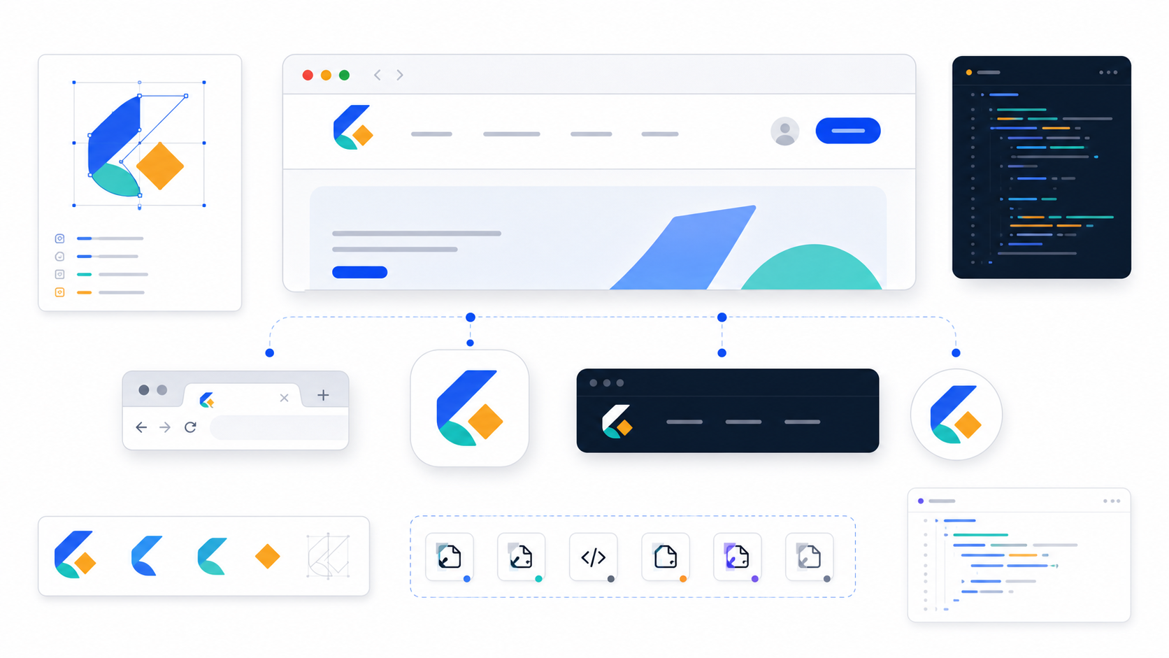
The fix is not to keep resizing the same export. Build a small responsive logo system: one SVG master, a header version, an icon mark, a favicon version, a one-color version, and a reversed dark-mode version. That gives you consistency without forcing every context to use the same shape.
What is a responsive SVG logo?
A responsive SVG logo is a set of logo variants that preserve the same brand idea across different sizes, shapes, and backgrounds. Instead of stretching one full logo into every placement, you use the right variant for the job: full wordmark for headers, icon mark for small spaces, and reversed artwork for dark UI.
Think of it as logo responsiveness, not CSS responsiveness. Your layout can scale an SVG, but scaling alone does not solve readability. A full wordmark might be perfect at 180px wide and useless at 16px. A detailed badge might look premium in a hero section and turn into a blob in a favicon.
Responsive logo variants are the practical answer: one brand, multiple approved shapes.
If you are still choosing the master logo, start with the SVG logo maker guide. If you already have a PNG or JPG logo, convert it with Image to SVG before you build variants.
Which logo variants do you actually need?
Most websites need five logo variants: primary header logo, compact logo mark, favicon mark, one-color logo, and reversed dark-mode logo. Bigger brands may add vertical lockups, partner badges, print files, and social templates, but those five cover the daily web and app cases.
Use this table as the fast decision rule:
| Variant | Best use | Typical shape | What to check |
|---|---|---|---|
| Primary logo | Desktop header, footer, invoices | Horizontal wordmark or combination mark | Clear at 120-220px wide |
| Compact mark | Mobile nav, app UI, small cards | Symbol, monogram, or cropped mark | Recognizable without the full name |
| Favicon | Browser tab, bookmarks | Simplified square-ish icon | Clear at 16x16 and 32x32 |
| One-color logo | Embroidery, stamps, monochrome UI | Single fill color | No meaning lost without gradients |
| Reversed logo | Dark mode, dark footer, overlays | Light artwork on transparent background | Enough contrast on dark surfaces |
Do not create variants just to feel thorough. Create them because a real placement needs them.
For an initials-based identity, first build a clean master with the monogram logo maker guide, then derive the compact and favicon variants from that same geometry.
How do you turn one SVG logo into responsive variants?
Start from the cleanest SVG master, then simplify the design for smaller contexts instead of only resizing it. The smaller the placement, the fewer details the logo should carry. Your favicon should usually come from the symbol, not from a squeezed full wordmark.
Use this workflow:
- Save the approved logo as
logo-primary.svg. - Duplicate it as
logo-mark.svgand remove the wordmark or secondary text. - Simplify tiny details that disappear below 32px.
- Create
logo-one-color.svgwith a single fill or stroke color. - Create
logo-reversed.svgfor dark backgrounds. - Create
favicon.svgfrom the icon mark, not the full header logo. - Export PNG fallbacks only after the SVG versions are approved.
Open each file in SVG Editor and check the canvas before exporting. The viewBox matters: W3C explains that viewBox helps SVG content fit a viewport, and MDN describes it as the attribute that defines the position and dimensions of the SVG viewport. In practice, a bad viewBox is why many logos crop, float off-center, or scale with weird padding.
If the canvas is wrong, fix that before you make PNG copies. The SVG viewBox guide walks through the common cropping and alignment problems.
What favicon sizes should you export from an SVG logo?
Design the favicon as SVG first, then test it at 16x16 and 32x32 pixels. After that, export practical PNG fallbacks such as 32x32, 180x180, 192x192, and 512x512 when the site needs browser, Apple touch icon, or web app manifest support.
MDN describes a favicon as the small icon displayed in browser tabs, bookmarks, and similar browser surfaces, and notes that it is usually 16x16. That is the painful test. If your mark fails at 16px, higher-resolution exports will not save it.
Use this starting set:
<link rel="icon" href="/favicon.svg" type="image/svg+xml" />
<link rel="icon" href="/favicon-32.png" sizes="32x32" type="image/png" />
<link rel="apple-touch-icon" href="/apple-touch-icon.png" />
<link rel="manifest" href="/site.webmanifest" />
And use this manifest shape when your site acts like an app:
{
  "icons": [
    {
      "src": "/icon-192.png",
      "sizes": "192x192",
      "type": "image/png"
    },
    {
      "src": "/icon-512.png",
      "sizes": "512x512",
      "type": "image/png",
      "purpose": "any maskable"
    }
  ]
}
MDN's web app manifest documentation explains that manifest icons represent the web application in different contexts, and its app-icon guidance covers maskable icons for operating-system icon shapes. The practical point: your favicon, app icon, and social avatar may all start from the same symbol, but they should not be blindly exported from the same canvas.
How should you design the favicon version?
Design the favicon version by removing everything that does not survive at tiny size: small text, thin interior lines, subtle gradients, fine negative spaces, and decorative shadows. A favicon is not a mini poster. It is a recognition mark.
Use this favicon checklist:
- Test at 16x16 and 32x32, not only in a large preview.
- Use the symbol or monogram, not the full wordmark.
- Increase interior spacing so shapes do not merge.
- Use fewer colors than the main logo.
- Avoid hairline strokes.
- Center the mark inside a square canvas.
- Keep enough padding for browser and OS cropping.
- Export a PNG fallback after approving the SVG.
If your primary logo has a detailed mascot, badge border, tagline, and gradient, the favicon should probably be a simplified head, initial, or geometric motif. It should feel related to the logo, but it does not need to contain every part of the logo.
For AI-generated logos, this is where consistency often breaks. The AI logo consistency guide explains why regenerating a favicon from a text prompt usually drifts away from the approved logo. A safer workflow is to derive the favicon from the actual logo mark.
Should the dark mode logo be a separate SVG?
Use a separate dark-mode SVG when the logo is important, multicolor, or brand-sensitive. CSS filters are fine for quick monochrome experiments, but a deliberate reversed SVG gives you control over contrast, color, spacing, and which details survive on dark backgrounds.
A dark-mode logo is not always a pure inversion. Some colors need adjustment to meet contrast expectations. Some shadows or outlines should be removed. Some dark fills need to become light fills, while accent colors stay brand-consistent.
Use this pattern:
<picture>
  <source srcset="/logo-reversed.svg" media="(prefers-color-scheme: dark)" />
  <img src="/logo-primary.svg" alt="Company name" width="160" height="40" />
</picture>
Or switch the asset in your app theme:
<img
  src={theme === "dark" ? "/logo-reversed.svg" : "/logo-primary.svg"}
  alt="Company name"
  width="160"
  height="40"
/>
Keep the dark version in the same family as the light version. Same geometry. Same viewBox. Same visual weight. Different colors only where the background demands it.
How do you keep responsive logo variants consistent?
Keep variants consistent by deriving them from the same SVG master, locking the color palette, preserving proportions, and testing the variants side by side. The goal is family resemblance: each file should look purpose-built for its placement without feeling like a different brand.
Use this consistency checklist before you ship:
- Primary, compact, favicon, and reversed variants use the same core shape language.
- Brand colors use exact hex values, not close approximations.
- Stroke weights feel related across sizes.
- The compact mark is derived from the primary logo.
- One-color and reversed versions keep the same silhouette.
- Each SVG has a correct
viewBox. - Each file has transparent background unless a background is intentional.
- PNG exports come from approved SVG files.
If your SVG came from a noisy raster trace, clean it before making variants. Start with the PNG to SVG converter settings guide, then run a conservative pass through SVG Optimizer. Do not optimize so aggressively that the favicon or wordmark changes shape.
What file names should you use?
Use file names that explain the job, not random dimensions or vague version numbers. Future you should know which logo belongs in a header, which belongs in dark mode, and which is the source for favicon exports.
A simple structure works:
/brand
  /svg
    logo-primary.svg
    logo-mark.svg
    logo-one-color.svg
    logo-reversed.svg
    favicon.svg
  /png
    favicon-32.png
    apple-touch-icon.png
    icon-192.png
    icon-512.png
    logo-social-square.png
This keeps the SVG files as the source of truth. The PNG files are delivery copies for browsers, operating systems, social platforms, and tools that do not accept SVG.
For a broader handoff folder, use the logo file formats guide. It covers SVG, PNG, EPS, PDF, favicon files, and when each format matters.
What is the fastest workflow in SVG Genie?
The fastest workflow is to create or convert the logo as SVG, make the compact mark and dark-mode version in the editor, optimize the final files, then export favicon and app-icon PNGs from the approved SVGs. That avoids the trap of editing raster copies later.
Before exporting those variants, use the website logo size guide to choose practical desktop and mobile header dimensions, set intrinsic image width and height, and avoid blurry PNG fallbacks.
Use this sequence:
- Create a new mark in Logo Maker, or convert an existing logo with Image to SVG.
- Open the result in SVG Editor.
- Save the primary SVG.
- Duplicate and simplify the icon mark.
- Create one-color and reversed variants.
- Fix the canvas with the viewBox guide if needed.
- Optimize carefully with SVG Optimizer.
- Export PNG fallbacks from the final SVG variants.
That gives you a real logo system instead of one pretty file that breaks under pressure.
FAQ
What is a responsive SVG logo?
A responsive SVG logo is a logo system with multiple SVG variants for different sizes and backgrounds, usually including a full header logo, compact icon mark, one-color version, reversed dark-mode version, and favicon-ready mark.
Can a favicon be SVG?
Modern browsers can use SVG favicons, but you should still provide PNG or ICO fallbacks for broad compatibility, bookmarks, older tools, and app-like install surfaces.
What size should a logo favicon be?
Design the source mark as SVG, then test it at 16x16 and 32x32 pixels. Also export larger 180x180, 192x192, and 512x512 PNG versions when the site needs Apple touch icons or web app manifest icons.
Should my dark mode logo be a CSS filter or a separate SVG?
Use a separate reversed or one-color SVG when the logo is important. CSS filters can work for simple monochrome marks, but separate SVG variants give better control over contrast, spacing, and brand color.
Why does my SVG logo get cropped after export?
The usual cause is a bad viewBox or artwork that sits outside the visible canvas. Open the file in an SVG editor, center the artwork, make sure the viewBox contains the full logo, then export the variants again.
Build the variant set before the logo starts breaking
The best time to create responsive logo variants is right after you approve the main logo. Make the header logo, compact mark, favicon, one-color version, and dark-mode version while the design is still fresh. Then every future use case starts from a clean SVG file instead of a rushed screenshot export.
Start with SVG Genie's logo maker if you need a new mark. Use Image to SVG if you are rescuing an existing raster logo. Either way, build the variants from the SVG master, then let PNG be the fallback.
Sources
Create your own SVG graphics with AI
Describe what you need, get a production-ready vector in seconds. No design skills required.
About This Article
This article was written by SVG Genie Team based on hands-on testing with SVG Genie’s tools and years of experience in vector design and web graphics. All recommendations reflect real-world usage and are reviewed by the SVG Genie editorial team for accuracy.
About the Author
SVG Genie Team
SVG Design Expert & Technical Writer at SVG Genie
SVG Genie Team is a vector design specialist and technical writer at SVG Genie with years of hands-on experience in SVG tooling, AI-assisted design workflows, and web graphics optimization. Their work focuses on making professional vector design accessible to everyone.
More articles by SVG Genie Teamarrow_forward