A logo can look perfect in a design tool and still wreck a website header. It may render blurry on a Retina screen, push the navigation onto a second line, arrive with mysterious empty padding, or make the page jump when it loads.
The fastest fix is to separate display size from file dimensions. Size the logo in CSS for the layout, keep a clean SVG as the default asset, and give the browser its intrinsic width and height so it can reserve space before the file loads.
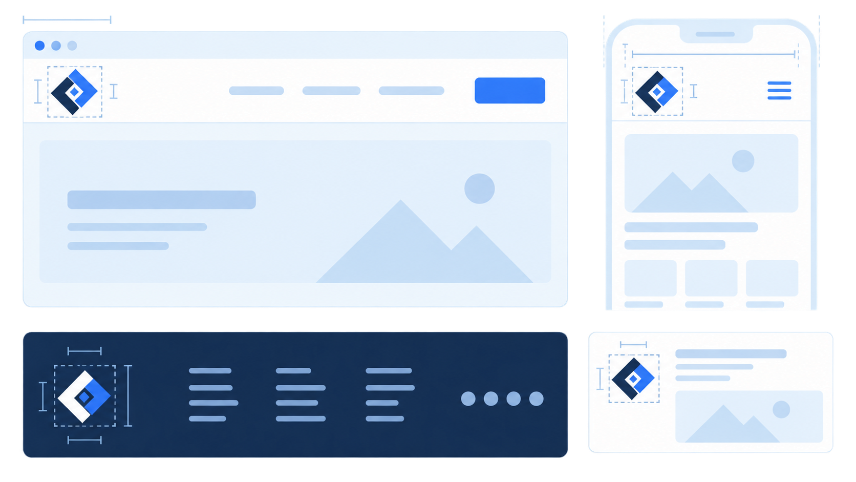
What size should a website logo be?
A horizontal website logo usually displays at 120-200 CSS pixels wide on desktop and 100-160 CSS pixels wide on mobile, with a visible height of roughly 24-48 CSS pixels. These are starting ranges, not platform rules. The correct size is the smallest one that keeps the name readable and the navigation comfortable.
Use this quick decision table:
| Placement | Starting display size | Best asset | Main check |
|---|---|---|---|
| Desktop header | 140-200px wide, 28-48px high | SVG | Nav still fits at common laptop widths |
| Mobile header | 100-160px wide, 24-36px high | SVG or compact SVG mark | Menu and actions have room |
| Footer | 120-180px wide | SVG | Enough contrast on footer background |
| Raster fallback | 2× the CSS display size | Transparent PNG | Never enlarged beyond source size |
| Social preview | 1200×630 canvas | PNG or JPG composition | Logo has safe padding and remains legible |
Do not begin with a huge arbitrary canvas and hope CSS fixes it. First decide how much header space the brand should occupy. Then make the asset fit that job.
If you still need the mark itself, create a clean vector in the SVG logo maker. If you only have a screenshot or PNG, convert the image to SVG before building website variants.
What does “logo dimensions” actually mean?
Logo dimensions are the width, height, aspect ratio, and internal canvas bounds of a logo asset. On a website, there are two separate sets: the file's intrinsic dimensions and the CSS dimensions at which the browser displays it. Mixing them up causes most blurry, oversized, and shifting-logo problems.
For example, an SVG can declare a viewBox="0 0 800 200" but display at width: 160px. It remains sharp because the browser redraws vector paths at the required size. A 160×40 PNG displayed at 320×80, however, must stretch its pixels and will look soft.
The aspect ratio matters more than the original SVG canvas number. An 800×200 SVG and a 400×100 SVG both have a 4:1 ratio. They can display identically if their artwork and viewBox are clean.
Should a website logo be SVG or PNG?
Use SVG for most wordmarks, monograms, and geometric marks. It stays sharp across screen densities, usually downloads efficiently, and adapts cleanly to responsive layouts. Use PNG when the artwork relies on photographic texture, when a third-party platform rejects SVG, or when you need a fixed social-preview composition.
For photography businesses, size is only half the problem: the same identity also needs quiet light and dark watermark variants. Use the photography logo maker workflow to test the compact mark over real images before exporting it.
| Requirement | SVG | PNG |
|---|---|---|
| Sharp at every size | Yes | Only at or below source dimensions |
| Editable colors and paths | Yes | No |
| Transparent background | Yes | Yes |
| Texture or photo detail | Poor fit | Good fit |
| High-density display | Same file | Export around 2× display size |
| Website header | Preferred | Fallback |
SVG is not automatically small or safe. A traced photograph can create thousands of paths, and an untrusted SVG can contain active markup. Optimize your own artwork conservatively, and sanitize SVG files received from unknown sources. The SVG upload security checklist covers the latter case.
For a broader handoff package, see the logo file formats guide. It explains when SVG, PNG, PDF, and EPS each belong in the folder.
How should you size an SVG logo in HTML and CSS?
Give the image width and height attributes that match its aspect ratio, then use CSS to set the actual responsive display size. The attributes let the browser reserve space before download; CSS lets the layout adapt without distorting the logo.
<a class="brand" href="/" aria-label="Acme home">
  <img
    src="/logo.svg"
    alt="Acme"
    width="640"
    height="160"
  />
</a>
.brand img {
  display: block;
  width: clamp(7.5rem, 12vw, 11rem);
  height: auto;
}
The example keeps the original 4:1 aspect ratio while allowing a responsive width between 120px and 176px. MDN's guidance on the HTML img element explains that intrinsic width and height let user agents calculate an aspect ratio before the image loads. That reserved box helps reduce layout shift.
Avoid setting both CSS width and height to unrelated fixed values. That stretches the mark. Set one dimension and leave the other as auto, or use object-fit: contain inside a deliberately sized wrapper.
Why does a logo look too small even when its width is correct?
A logo often looks too small because the SVG canvas contains empty space around the artwork. CSS sizes the entire viewBox, including invisible padding, so the visible mark occupies only part of the declared width. Fix the canvas bounds instead of making the header image larger.
Use this diagnosis:
- Open the SVG in SVG Editor.
- Turn on a visible page background or selection bounds.
- Check whether the artwork reaches the canvas edges with intentional padding only.
- Remove stray invisible objects outside the logo.
- Tighten the
viewBoxwithout clipping strokes or shadows. - Test the repaired file at its real header size.
If the mark becomes cropped, the viewBox is too tight or ignores stroke width. Follow the SVG viewBox guide before exporting more copies.
How large should a PNG logo be for Retina screens?
Export a PNG at roughly twice the intended CSS dimensions. If the logo displays at 160×40 CSS pixels, use a 320×80 PNG source. The browser displays more source pixels within the same CSS box, which produces cleaner edges on high-density screens without changing the layout size.
<img
  src="/logo-320.png"
  srcset="/logo-320.png 1x, /logo-640.png 2x"
  alt="Acme"
  width="160"
  height="40"
/>
That said, do not manufacture a 2× export when SVG already suits the artwork. A real vector logo is simpler than maintaining several raster copies. Reserve raster variants for tools, email clients, textures, social cards, and other cases that genuinely need them.
How do desktop and mobile logo sizes differ?
Mobile headers usually need a shorter wordmark or icon-only variant, not merely a smaller desktop logo. A long business name that reads well at 180px may become illegible at 110px while still stealing space from the menu and primary action.
Use this order of preference:
- Keep the full wordmark if it remains readable around 120-140px wide.
- Remove a tagline before shrinking the main name.
- Switch to a compact lockup when the full logo crowds the navigation.
- Use the icon mark only when it is already recognizable.
- Never squeeze the aspect ratio to make a long logo fit.
The responsive SVG logo variants guide shows how to derive a compact mark, favicon, reversed version, and one-color asset from one approved master.
How do you prevent a website logo from slowing the page?
Keep the logo simple, remove unused SVG metadata, avoid embedded raster images, and load only the variant the header actually uses. A logo is often above the fold, so unnecessary bytes and late size discovery can affect perceived speed even when the rest of the page is optimized.
Run this checklist:
- Use clean SVG paths rather than a base64-embedded PNG.
- Remove editor metadata and hidden layers.
- Keep the
viewBoxaccurate. - Include intrinsic
widthandheight. - Do not lazy-load the immediately visible header logo.
- Avoid shipping desktop and mobile logo files simultaneously when CSS or
<picture>can select one. - Optimize carefully and compare the rendered result afterward.
The web.dev image-performance guidance recommends explicit image dimensions to reduce layout shifts, while MDN documents responsive image selection with srcset and <picture>. For simple vector logos, one well-built SVG often beats a complicated responsive raster setup.
What is the fastest logo-sizing workflow?
Start with one approved SVG master, test it in the real header, repair its canvas, then make a compact mobile variant only if the full wordmark fails. Export PNG fallbacks last. This order prevents you from generating a pile of incorrectly sized files from a broken source.
- Create the mark with Logo Maker or convert it with Image to SVG.
- Set the desktop display width around 160px and test the navigation.
- Test the same file around 120px on mobile.
- Tighten the
viewBoxif visible artwork looks undersized. - Add HTML width and height attributes with the correct aspect ratio.
- Create a compact mobile mark only if the full wordmark fails.
- Export 2× PNG fallbacks only where SVG is unsupported.
- Check light, dark, narrow, and high-density screens before shipping.
This workflow reduces the job to one decision: what is the smallest display size at which this specific mark stays readable? Everything else follows from the answer.
FAQ
What size should a website logo be?
A horizontal website logo usually displays around 120-200 CSS pixels wide on desktop and 100-160 CSS pixels wide on mobile, with a header height around 24-48 CSS pixels. Treat these as starting ranges, then choose the smallest size at which the wordmark stays readable.
Should a website logo be SVG or PNG?
Use SVG for most wordmarks and geometric logos because it stays sharp at any screen density. Use PNG when the artwork contains raster texture or when a platform does not accept SVG; export the PNG at about twice its intended CSS dimensions for high-density screens.
Why is my website logo blurry?
A blurry logo is usually a small raster file being enlarged by CSS, a low-resolution screenshot, or artwork with soft edges. Replace it with a true SVG or export a PNG at twice the displayed width and height.
How do I stop a logo from causing layout shift?
Give the image intrinsic width and height attributes, then control the rendered size with CSS. The browser can reserve the correct aspect-ratio box before the logo downloads, reducing layout movement.
Is 500×500 a good website logo size?
A 500×500 file is square, so it may work for an icon or social avatar but is usually the wrong shape for a horizontal website header. Use a horizontal SVG wordmark in the header and keep the square mark for favicons, avatars, and compact mobile placements.
Make the source file correct before making more exports
The best website logo size is not one universal pixel number. It is a readable CSS display size backed by a clean asset: typically SVG for the header, a compact variant for constrained mobile layouts, and 2× PNG only where raster output is required.
Build the master in SVG Genie's Logo Maker, test it in the real layout, and fix the canvas before exporting anything else. Ten perfect exports from a padded or blurry source are still ten wrong files.
Sources
Create your own SVG graphics with AI
Describe what you need, get a production-ready vector in seconds. No design skills required.
About This Article
This article was written by SVG Genie Team based on hands-on testing with SVG Genie’s tools and years of experience in vector design and web graphics. All recommendations reflect real-world usage and are reviewed by the SVG Genie editorial team for accuracy.
About the Author
SVG Genie Team
SVG Design Expert & Technical Writer at SVG Genie
SVG Genie Team is a vector design specialist and technical writer at SVG Genie with years of hands-on experience in SVG tooling, AI-assisted design workflows, and web graphics optimization. Their work focuses on making professional vector design accessible to everyone.
More articles by SVG Genie Teamarrow_forward