A construction logo can look impressive on a laptop and turn into an unreadable patch on a work shirt or a blurry mark across a truck door. The usual problem is too much detail: a roof, hammer, wrench, skyline, and slogan all fighting inside one small badge.
The fastest route to a usable logo is to choose one recognizable shape, test it in solid black, and approve it on a truck-sized mockup and a 32-pixel icon before adding polish. This guide shows how to use a construction logo maker without ending up with a generic or production-unfriendly file.
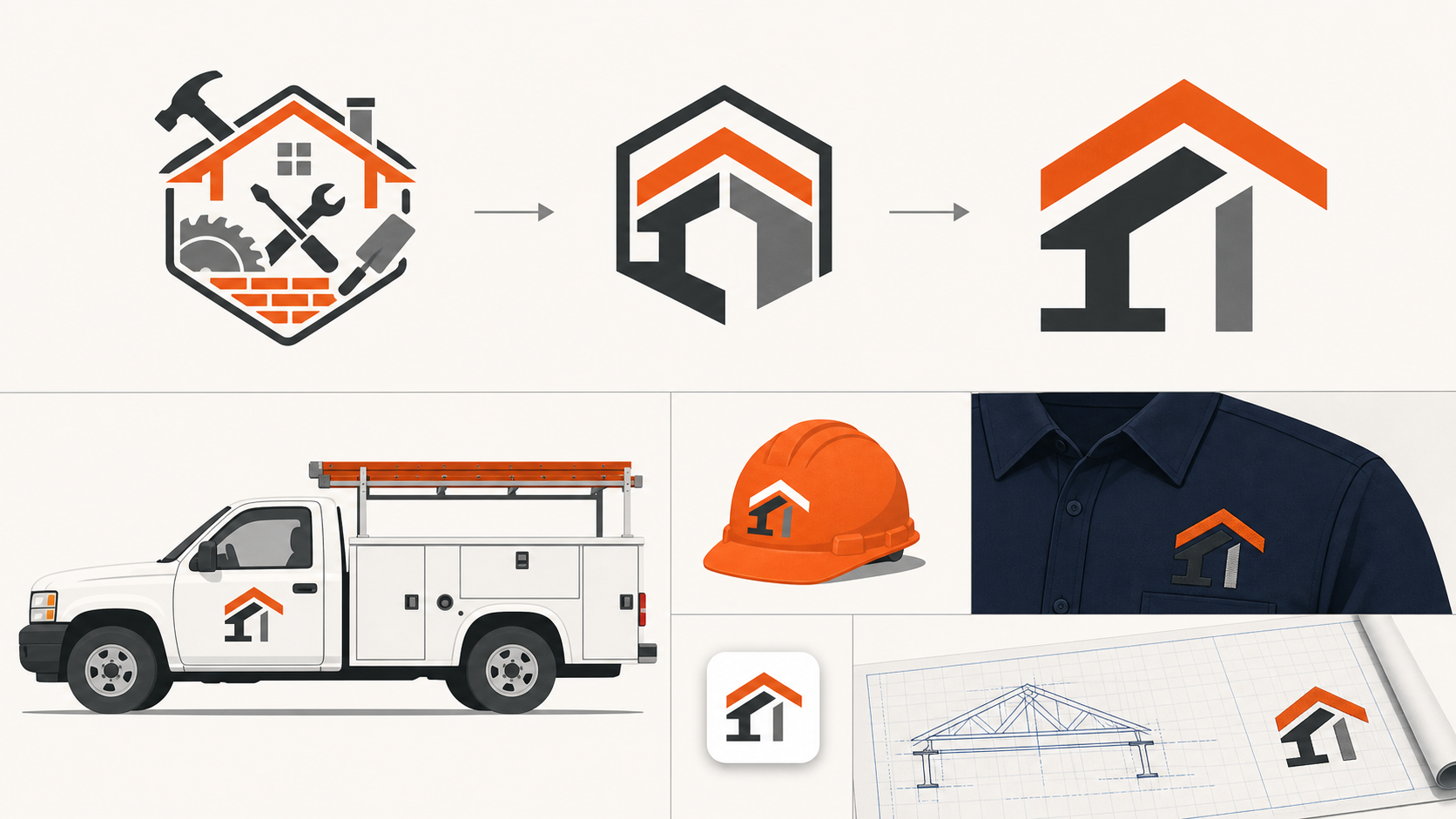
What makes a good construction company logo?
A good construction company logo is recognizable at a glance, readable from a distance, and simple enough to reproduce on vehicles, uniforms, site signs, invoices, and digital profiles. It needs a strong silhouette, controlled detail, high contrast, and a vector master that remains sharp at every size.
A construction logo is a visual identifier designed to represent a builder, contractor, or trade business across physical and digital applications. Its job is recognition, not a literal diagram of every service the company provides.
Use this five-second decision rule: shrink the logo to a social avatar, turn it black, and imagine it passing on a truck. If the business name and main symbol no longer register, simplify before doing anything else.
What is the fastest way to make a construction logo?
The fastest workflow is to define the service and brand trait, generate several one-symbol concepts, reject weak silhouettes, and refine only the strongest direction. Starting in black and white prevents color, texture, and mockups from disguising a structurally weak mark.
- Name the main service: residential building, remodeling, roofing, concrete, excavation, or commercial contracting.
- Choose one desired impression: dependable, precise, established, premium, fast, or industrial.
- Generate four concepts using one symbol family at a time.
- Compare them in solid black at 32 pixels and from several feet away.
- Keep the clearest concept and remove nonessential detail.
- Pair it with sturdy, legible lettering.
- Export an SVG master and practical PNG variants.
Start a concept in SVG Genie's logo maker, then adjust paths, colors, and canvas spacing in the SVG editor. This is faster than polishing ten directions that have not passed a basic legibility test.
The same production test applies to outdoor-service brands: the landscaping logo maker guide shows how to test a mark on yard signs, polos, and work trucks.
Which construction logo style should you choose?
Choose a style that matches the work customers actually hire you to do. Rooflines and home silhouettes suit residential contractors, structural geometry fits commercial builders, and strong lettermarks give multi-service firms room to grow without tying the brand to one tool or trade.
| Logo direction | Best for | Strength | Common failure |
|---|---|---|---|
| Roofline or house | Home builders and remodelers | Immediate residential cue | Looks like every real-estate logo |
| Beam or structural grid | Commercial and industrial firms | Precise, engineered feeling | Becomes too technical at small sizes |
| Monogram | Multi-service contractors | Distinctive and scalable | Initials become tangled or unclear |
| Badge or crest | Established local businesses | Heritage and authority | Too much text around the edge |
| Tool symbol | Specialized trades | Communicates service quickly | Generic clip-art appearance |
| Abstract geometric mark | Design-build and modern firms | Ownable, flexible identity | Meaning feels arbitrary |
Do not choose a symbol just because competitors use it. If every local contractor has a peaked roof over the business name, a simple monogram or structural shape will be easier to recognize.
How do you write a useful construction logo prompt?
A useful prompt names the business type, one visual idea, the desired personality, a limited palette, and the applications the logo must survive. It should also ban gradients, tiny details, mockup-only effects, and multiple competing symbols.
Use this formula:
Create a [personality] logo for a [specific construction business].
Use one [symbol or geometric idea] with [lettering style].
Palette: [one dominant color] and [one supporting color].
It must remain clear on a truck door, hard hat, embroidered shirt,
job-site sign, and 32px favicon. Flat vector shapes, transparent
background, no gradients, no fine detail, no generic clip art.
Example: “Create a precise, established logo for a commercial concrete contractor. Use one geometric foundation-block symbol with a bold condensed wordmark. Charcoal and safety orange. It must work on trucks, hard hats, embroidery, signs, and a 32px favicon.”
Generate one variable at a time. If you change the symbol, type style, palette, and layout together, you will not know which decision improved the result.
Which symbols should a contractor logo avoid?
Avoid crowded combinations and symbols unrelated to the core service. A house plus crane plus hammer plus wrench does not communicate breadth; it creates visual noise. Also avoid stock marks so common that customers could mistake your business for a competitor.
Watch for these failure modes:
- A generic roofline copied by dozens of local companies.
- Detailed machinery that collapses when embroidered.
- A hammer or saw replacing a letter and reducing readability.
- Thin blueprint lines that vanish on vehicle vinyl.
- A shield, stars, and ribbon added only to imply authority.
- Gradients or shadows required to separate overlapping shapes.
- A mascot whose expression does not match a serious commercial bid.
If a familiar symbol is genuinely useful, customize its geometry. Connect a roof angle to an initial, turn a beam arrangement into a distinctive monogram, or build a memorable negative-space opening. One owned detail beats five borrowed icons.
How should a construction logo be tested?
Test the logo in the environments where customers and crews will see it, not only on a presentation page. The minimum useful test covers a truck, hard hat, embroidered shirt, site sign, invoice header, social avatar, website header, and one-color reproduction.
Run this approval checklist:
- The company name is readable from a realistic truck-viewing distance.
- The symbol is recognizable at 32 pixels.
- The mark works in solid black without effects.
- Thin gaps and strokes survive embroidery.
- Vehicle colors do not erase part of the logo.
- The horizontal layout fits a website header and truck door.
- A compact variant fits social avatars and hard hats.
- The SVG contains vectors rather than an embedded bitmap.
- The canvas has intentional padding and does not crop the artwork.
- The concept has been checked against direct competitors.
Create a primary horizontal logo and a compact icon variant instead of forcing one layout into every placement. The responsive SVG logo variants guide explains how to keep those versions consistent.
Why is SVG the best master format for a construction logo?
SVG is the best master format because its vector shapes stay sharp from a tiny website icon to a large site sign or vehicle graphic. Colors and paths remain editable, and vendors can scale the artwork without rebuilding a pixelated file.
MDN describes SVG as an XML-based format for two-dimensional vector graphics. A proper logo SVG should contain paths and shapes, not merely a JPEG placed inside an SVG container.
Keep these deliverables:
| File | Purpose |
|---|---|
| Primary SVG | Editable master for web, signs, and vehicles |
| One-color SVG | Embroidery, stamps, vinyl, and constrained printing |
| Reversed SVG | Dark trucks, uniforms, and backgrounds |
| Transparent PNG | Social profiles and software without SVG support |
| Print PDF/EPS | Only when requested by a production vendor |
If your current logo exists only as a small image, use Image to SVG as a starting point and follow the low-resolution logo conversion guide. Simple flat marks can trace well; distorted lettering and fine detail are usually cleaner when rebuilt.
Why does a construction logo fail on trucks or shirts?
Truck graphics fail when lettering is too small, contrast is weak, or the layout ignores doors and body seams. Embroidery fails when strokes and gaps are thinner than the production method can hold. Both problems come from approving the logo at only one comfortable screen size.
| Symptom | Likely cause | Fast fix |
|---|---|---|
| Name disappears at a distance | Thin or overly wide lettering | Use heavier type and a shorter lockup |
| Mark vanishes on the truck | Insufficient color contrast | Add a true reversed color version |
| Shirt logo fills in | Tiny gaps and fine strokes | Simplify shapes and enlarge openings |
| Sign looks blurry | Enlarged raster file | Supply the vector SVG master |
| Logo is cropped online | Incorrect SVG viewBox | Add intentional canvas space |
| Icon becomes unrecognizable | Full logo forced into a square | Create a compact symbol variant |
Ask each vendor for its actual production constraints before final export. Screen printing, embroidery, cut vinyl, and illuminated signs do not preserve detail in the same way.
How do you make a construction logo look established rather than generic?
An established-looking logo relies on disciplined geometry, consistent lettering, and repeatable use—not extra decoration. Pick one construction-related idea, make its proportions intentional, and use the same approved files and colors everywhere customers encounter the company.
Consistency creates familiarity. Put the same mark on estimates, trucks, uniforms, fencing, project photos, and the website. Avoid using a badge on one surface, a roof icon on another, and an unrelated social avatar elsewhere.
Before committing to a generated concept, compare it with local and national competitors and perform an appropriate trademark search in the markets where you operate. AI generation does not guarantee originality or legal clearance.
What should you do next?
Write down your main service and one brand trait, generate four one-symbol concepts, and reject anything that fails in black at small size. Then create the strongest direction with the construction logo maker, clean it in the SVG editor, and test it on a truck, shirt, sign, and favicon before ordering production.
The goal is not the most detailed logo. It is the mark customers recognize quickly and your team can use everywhere without repairing the file.
Frequently asked questions
What makes a good construction company logo?
A good construction logo is simple, distinctive, and readable from a distance. It uses a bold silhouette, limited colors, sturdy lettering, and enough contrast to work on trucks, uniforms, signs, invoices, and small digital icons.
What colors work best for a construction logo?
Black, navy, charcoal, orange, yellow, red, and white are practical choices because they create strong contrast. Choose one dominant color and one supporting color, then confirm the logo also works in solid black for embroidery, stamps, and low-cost printing.
Should a construction logo include a house or tools?
Only when the symbol helps identify the service. A roofline can suit residential builders, while a beam, crane, or geometric monogram may fit commercial contractors. Avoid combining a house, hammer, wrench, skyline, and hard hat in one crowded mark.
What file format should a contractor use for a logo?
Keep SVG as the editable master because it scales cleanly for vehicles and signage. Also export transparent PNG files for social profiles and office software, plus PDF or EPS when a sign shop or printer specifically requests one.
Create your own SVG graphics with AI
Describe what you need, get a production-ready vector in seconds. No design skills required.
About This Article
This article was written by SVG Genie Team based on hands-on testing with SVG Genie’s tools and years of experience in vector design and web graphics. All recommendations reflect real-world usage and are reviewed by the SVG Genie editorial team for accuracy.
About the Author
SVG Genie Team
SVG Design Expert & Technical Writer at SVG Genie
SVG Genie Team is a vector design specialist and technical writer at SVG Genie with years of hands-on experience in SVG tooling, AI-assisted design workflows, and web graphics optimization. Their work focuses on making professional vector design accessible to everyone.
More articles by SVG Genie Teamarrow_forward