Your SVG should scale cleanly, but one wrong dimension can turn a round logo into an oval, crop the edge of an icon, or leave a tiny graphic floating inside a huge box.
The fastest fix is simple: keep the viewBox, lock the aspect ratio, and change the displayed width or height—not the internal coordinates. If the original is 600 × 400, resize it to 300 × 200 or 900 × 600. Do not force it into 300 × 300 unless you intentionally want padding or cropping.
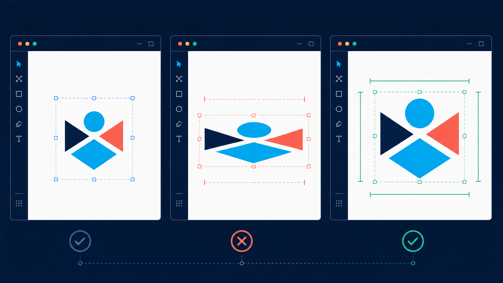
How do you resize an SVG without distortion?
Resize an SVG without distortion by preserving its original width-to-height ratio. Keep the viewBox, set one output dimension, and calculate the other from the same ratio. In a visual editor, enable the proportional or locked-ratio control. On a website, use width: 100% with height: auto.
SVG aspect ratio is the relationship between an image's width and height. A viewBox="0 0 600 400" has a 3:2 ratio because 600 divided by 400 equals 1.5.
Use this five-step workflow:
- Open the file in SVG Editor.
- Note the
viewBoxwidth and height. - Turn on proportional scaling or lock the aspect ratio.
- Enter one target dimension and let the other update.
- Export, then inspect the file at its real destination size.
If the artwork came from a JPG or PNG, create the vector first with Image to SVG, then resize the SVG. Making the raster source larger before tracing does not create extra real detail.
What size should the resized SVG be?
Choose the SVG's display size from where it will appear: the CSS box for a website, the artboard for a design file, or the physical dimensions for a cutting workflow. SVG paths do not need extra pixels for sharpness, so the right size is the layout size rather than an arbitrary high-resolution export.
| Destination | Best sizing method | Example |
|---|---|---|
| Responsive website | Keep viewBox; size with CSS | width: 100%; height: auto |
| Fixed icon | Set matching width and height | 24 × 24 for a square icon |
| Logo | Set one dimension; keep ratio | width="240" height="80" |
| Social or print layout | Fit within the artboard proportionally | 3:2 artwork stays 3:2 |
| Cutting machine | Use intended physical size and test | 100 mm wide with height locked |
For a quick calculation:
new height = new width × original height ÷ original width
For a 600 × 400 SVG resized to 300 pixels wide:
300 × 400 ÷ 600 = 200 pixels high
The correct result is 300 × 200. This decision takes seconds and prevents most stretched exports.
Should you change width, height, or viewBox?
Change width and height to control how large the SVG appears. Keep the viewBox when the artwork already fits correctly. Change the viewBox only when you need to repair cropping, remove excess canvas, or alter which part of the drawing is visible.
<svg viewBox="0 0 600 400" width="300" height="200"
     preserveAspectRatio="xMidYMid meet">
  <!-- vector artwork -->
</svg>
The attributes do different jobs:
viewBoxdefines the internal coordinate system and visible region.widthsets the displayed width.heightsets the displayed height.preserveAspectRatiocontrols how the viewBox fits when the outer box has a different ratio.
The W3C SVG 2 specification defines the SVG viewport and coordinate-system behavior, while MDN's preserveAspectRatio reference documents the alignment and scaling options.
If changing the size reveals cut-off artwork or unexpected whitespace, stop resizing and fix the canvas with the SVG viewBox guide. That is a framing problem, not a scale problem.
Why does an SVG stretch after resizing?
An SVG stretches when the outer width-to-height ratio differs from the internal viewBox ratio and the renderer is allowed to scale each axis independently. It can also happen when a design tool unlocks proportions, CSS forces both dimensions, or an editor rewrites the original sizing attributes.
| Symptom | Likely cause | Fast fix |
|---|---|---|
| Circle becomes an oval | Width and height ratios differ | Lock proportions or recalculate one dimension |
| Logo is cropped | viewBox is too small or CSS clips overflow | Expand the viewBox or remove clipping |
| Large empty margins | viewBox includes unused canvas | Crop the canvas without changing paths |
| SVG stays tiny | Fixed width or height overrides the container | Remove the fixed dimension or use responsive CSS |
| Lines look uneven | Non-uniform transform scales strokes | Use proportional scaling and inspect transforms |
| Image looks blurry | SVG contains an embedded bitmap | Replace or re-export the raster asset |
Avoid preserveAspectRatio="none" unless distortion is deliberate. That value makes the artwork fill the viewport even when the horizontal and vertical scale factors differ.
How do you make an SVG responsive with CSS?
Make an SVG responsive by retaining a valid viewBox, removing conflicting fixed dimensions when appropriate, and letting CSS control its layout width. Set height: auto so the browser derives the height from the intrinsic ratio, and use max-width when the SVG should not grow indefinitely.
<img class="responsive-logo" src="/logo.svg" alt="Company name" />
.responsive-logo {
  display: block;
  width: 100%;
  max-width: 320px;
  height: auto;
}
For inline SVG, the same layout idea applies:
.responsive-icon {
  width: clamp(24px, 5vw, 64px);
  height: auto;
}
Do not use CSS to repair a bad internal canvas. If the visible drawing occupies only half the viewBox, a responsive width will scale the empty space too. Use the crop SVG workflow first, then add responsive sizing.
Can you enlarge an SVG without losing quality?
You can enlarge true vector paths without pixelation because the renderer redraws their geometry at the requested size. Quality can still suffer when the file contains an embedded raster image, heavy filters, hairline strokes, or a low-detail trace. Inspect the SVG structure before assuming every element is vector.
Search the markup for <image. If it points to PNG, JPEG, WebP, or base64 image data, that portion still has a fixed pixel resolution. Enlarging the SVG container enlarges that bitmap too.
Before a large export, check:
- Paths and shapes remain sharp at 200% zoom.
- No
<image>element contains a low-resolution bitmap. - Thin strokes remain visible at the final size.
- Shadows and blur filters do not get clipped.
- Text uses an available font or has been outlined when portability matters.
- The final file still opens correctly after optimization.
If the file becomes unnecessarily heavy, run it through SVG Optimizer only after the resize looks correct.
What is the safest resize checklist?
The safest SVG resize checklist is to keep an untouched original, confirm the viewBox, lock the aspect ratio, alter one dimension, preview the result, and test the exported file in its actual layout. This separates resizing errors from cropping, conversion, and CSS problems.
- Duplicate the original SVG.
- Confirm the
viewBoxhas four valid numbers. - Calculate the original width-to-height ratio.
- Lock proportional scaling.
- Change one dimension and derive the other.
- Check circles, logos, and faces for visible stretching.
- Inspect edges for clipped strokes, filters, or shadows.
- Test at small and large display sizes.
- Test inside the real website, CMS, app, or cutting software.
- Optimize only after the visual test passes.
FAQ
How do I resize an SVG without distortion?
Keep the original aspect ratio, preserve the viewBox, and change either width or height while letting the other dimension scale automatically. For responsive websites, keep the viewBox and use CSS such as width: 100%; height: auto.
Why does my SVG stretch when I resize it?
An SVG stretches when its display width and height use a different ratio from its viewBox and proportional scaling is disabled. Match the ratios or use preserveAspectRatio="xMidYMid meet" to keep the artwork proportional.
Should I change the SVG viewBox to make it larger?
No. Change the displayed width and height to make an SVG larger. The viewBox describes the internal coordinate system; changing it can zoom, crop, or add whitespace instead of simply resizing the image.
Can an SVG become blurry when enlarged?
Vector paths stay sharp when enlarged, but embedded raster images, filter effects, and very thin strokes may look soft. Check whether the SVG contains an <image> element and test the final file at its real display size.
What is the best CSS for a responsive SVG?
A common responsive pattern is width: 100%; height: auto on an SVG that has a valid viewBox. Add max-width when the graphic should stop growing beyond a chosen size.
Resize once, then use it everywhere
To resize an SVG cleanly, preserve the viewBox, keep the aspect ratio locked, and change the display dimensions. If the image stretches, compare the outer ratio with the viewBox. If it crops, fix the canvas. If it blurs, check for an embedded bitmap.
Open your file in SVG Editor, set the target width with proportions locked, preview the result, and export the clean version for your site or design.
Create your own SVG graphics with AI
Describe what you need, get a production-ready vector in seconds. No design skills required.
About This Article
This article was written by SVG Genie Team based on hands-on testing with SVG Genie’s tools and years of experience in vector design and web graphics. All recommendations reflect real-world usage and are reviewed by the SVG Genie editorial team for accuracy.
About the Author
SVG Genie Team
SVG Design Expert & Technical Writer at SVG Genie
SVG Genie Team is a vector design specialist and technical writer at SVG Genie with years of hands-on experience in SVG tooling, AI-assisted design workflows, and web graphics optimization. Their work focuses on making professional vector design accessible to everyone.
More articles by SVG Genie Teamarrow_forward