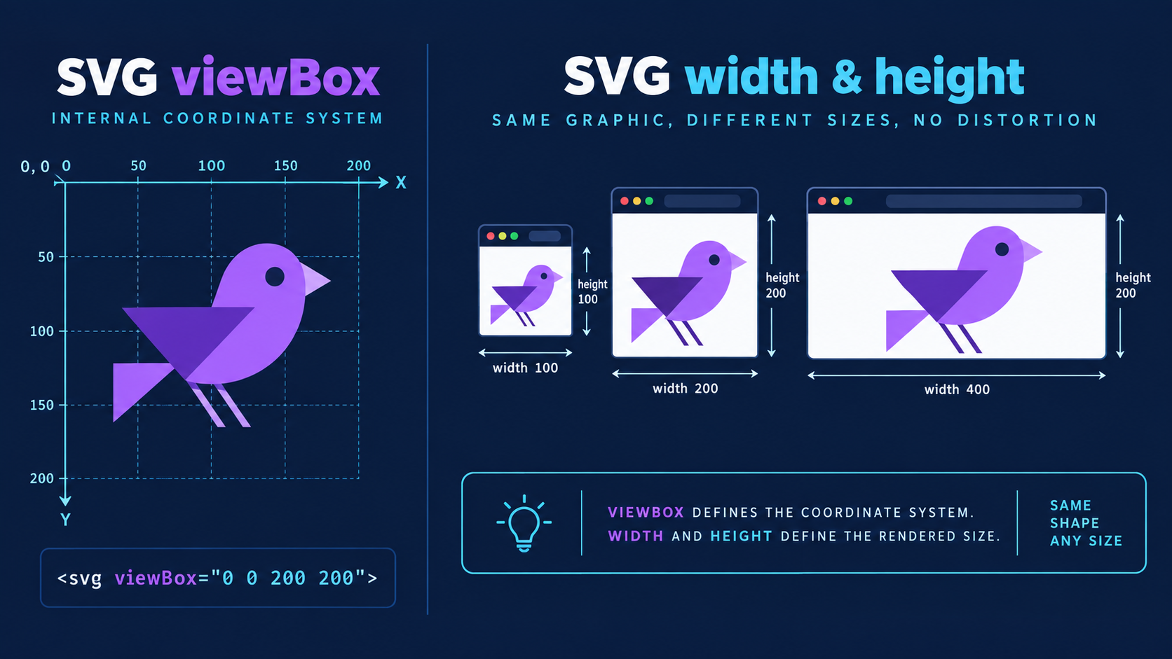
An SVG can have viewBox="0 0 240 80", width="240", and height="80" at the same time because those values do different jobs. The viewBox describes the internal drawing space; width and height describe the space the SVG occupies in the layout.
The fast rule: keep a correct viewBox, use width and height for a fixed or fallback size, and use CSS for responsive display. Do not change the viewBox just to make an SVG look larger.
What is the difference between SVG viewBox and width and height?
The viewBox defines four internal values—minimum x, minimum y, width, and height—that frame the artwork and establish its coordinate system. The outer width and height establish the viewport: the rendered box in the page. The browser maps the internal viewBox into that external box.
SVG viewport is the rectangular layout area in which an SVG is rendered. SVG viewBox is the internal rectangle in user units that gets mapped into that viewport.
<svg
  viewBox="0 0 240 80"
  width="480"
  height="160"
  xmlns="http://www.w3.org/2000/svg"
>
  <path d="..." />
</svg>
Here, the drawing uses a 240 × 80 internal grid but appears in a 480 × 160 viewport. Both ratios are 3:1, so the artwork scales by 2 without distortion. The MDN viewBox reference describes this mapping, and the SVG 2 coordinate-system specification defines how the browser computes it.
If the artwork itself is framed incorrectly, repair it with the SVG viewBox guide. If the frame is right and only the display size is wrong, leave the viewBox alone.
Which SVG sizing pattern should you use?
Use a fixed pattern for interface icons, a fluid pattern for responsive content, and a constrained pattern for logos or illustrations that should grow only to a limit. In every case, retain the viewBox so the browser knows the artwork's intrinsic ratio and can scale its internal coordinates.
| Use case | Recommended markup or CSS | Why |
|---|---|---|
| Fixed UI icon | width="24" height="24" viewBox="0 0 24 24" | Predictable box and coordinate grid |
| Fluid article image | viewBox plus width: 100%; height: auto | Fills the container without distortion |
| Responsive logo | width: 100%; max-width: 240px; height: auto | Shrinks on small screens, stops growing |
| CSS-sized inline icon | width: 1em; height: 1em | Follows the surrounding text size |
| Intentional crop | Mismatched viewport plus preserveAspectRatio="xMidYMid slice" | Covers the box and clips overflow |
For a file you need to inspect or resize now, open it in SVG Editor. When the geometry is correct, use SVG Optimizer without deleting the viewBox.
What is the safest responsive SVG code?
The safest general-purpose responsive pattern keeps the viewBox, removes hard-coded dimensions only when the layout supplies a size, and applies width: 100%; height: auto. Add a max-width when the asset should not grow indefinitely. This preserves the viewBox ratio while allowing the container to control width.
<svg
  class="responsive-logo"
  viewBox="0 0 240 80"
  role="img"
  aria-labelledby="logo-title"
  xmlns="http://www.w3.org/2000/svg"
>
  <title id="logo-title">Acme logo</title>
  <path d="..." />
</svg>
.responsive-logo {
  display: block;
  width: 100%;
  max-width: 240px;
  height: auto;
}
For an external file displayed with <img>, the same CSS pattern works:
<img class="responsive-logo" src="/logo.svg" alt="Acme" />
Keep explicit width and height on the <img> when you know the intended aspect ratio and want the browser to reserve layout space before the file loads. CSS can still make the image fluid.
When should you keep width and height attributes?
Keep width and height when an SVG needs a dependable default size, when it is a fixed interface icon, or when another system may render it without your stylesheet. Dimensions are not inherently bad; conflicting or misleading dimensions are. A valid width, height, and viewBox can work together cleanly.
Keep them for:
- Icons that must occupy an exact 16, 20, 24, or 32 pixel box
- Logos embedded in documents, email templates, or CMS fields with uncertain CSS
- Standalone SVG files that should open at a sensible size
<img>elements where dimensions reserve space and reduce layout movement- Assets consumed by software that expects intrinsic dimensions
Remove or override them when a hard-coded export size prevents the asset from fitting its responsive container. The safer compromise is often to retain useful dimensions in the file and override them in page CSS.
When can you remove width and height from an SVG?
You can remove fixed dimensions when the SVG has a valid viewBox and a reliable layout rule supplies its rendered size. Before doing so, test every actual delivery context. A browser page with component CSS may work perfectly while a CMS thumbnail, email client, or standalone preview falls back to an unexpected size.
Use this decision checklist:
- The root
<svg>has a valid, non-zeroviewBox. - The viewBox tightly contains the intended artwork.
- CSS or the parent component supplies at least one usable dimension.
- The other dimension can remain automatic or is ratio-correct.
- The asset renders correctly as inline SVG and, if relevant, through
<img>. - CMS, email, document, and design-tool consumers have been tested.
- No optimizer removed accessibility labels, IDs, masks, or references.
If the SVG came from a bitmap trace, first use Image to SVG and clean the output. Responsive sizing cannot repair bad paths or a canvas with large empty margins.
Why does an SVG stretch or get cropped?
An SVG stretches when its external viewport and internal viewBox have different ratios and proportional scaling is disabled. It gets cropped when the viewBox excludes artwork, the layout clips overflow, or preserveAspectRatio="... slice" deliberately fills a mismatched viewport by trimming excess content.
| Symptom | Likely cause | Fix |
|---|---|---|
| Circle becomes an oval | preserveAspectRatio="none" | Remove it or use xMidYMid meet |
| Empty bars around artwork | Viewport ratio differs from viewBox | Match ratios or accept meet spacing |
| Edges disappear | ViewBox too tight or slice crops | Expand viewBox or use meet |
| SVG ignores container width | Fixed CSS or attribute wins | Apply max-width: 100% or fluid CSS |
| SVG is tiny in a large box | Artwork occupies a small part of viewBox | Crop unused internal canvas |
According to MDN's preserveAspectRatio reference, the attribute only controls scaling when a viewBox exists. Its default xMidYMid meet behavior preserves the ratio and keeps the full viewBox visible. slice fills and crops; none permits non-uniform stretching.
For a symptom-first walkthrough, use resize SVG without distortion.
Should an SVG optimizer remove viewBox, width, or height?
An optimizer should normally preserve the viewBox because responsive scaling and preserveAspectRatio depend on it. Removing width and height can be appropriate for a web-only fluid asset, but it is a deployment decision rather than a universal optimization win. Four short viewBox numbers are not meaningful file-size waste.
Optimize in this order:
- Keep an untouched source file.
- Confirm that the viewBox fits the artwork.
- Decide whether the delivery context needs intrinsic width and height.
- Remove metadata, hidden elements, redundant styles, and excess precision.
- Compare the optimized rendering at small, normal, and large sizes.
- Test the SVG inside its real component, not only in a file preview.
The SVG cleanup checklist covers safe structural cleanup. If your tool changes geometry, compare its precision settings with the SVG decimal precision guide.
Frequently asked questions
What is the difference between SVG viewBox and width and height?
The viewBox defines the SVG's internal coordinate system and visible artwork area. Width and height define the external viewport—the space the SVG occupies in a page or app. Keep a correct viewBox for scaling, then control display size with attributes or CSS.
Should an SVG have width and height attributes?
Use width and height for a predictable default or fixed-size icon. For a fluid image, keep the viewBox and use CSS such as width: 100%; height: auto. Removing dimensions without providing CSS can produce an unintended default size.
Can I remove width and height from an SVG?
Yes, if the SVG has a valid viewBox and its size is controlled by CSS or its layout context. Test standalone image use, email, CMS previews, and older integrations first because they may rely on intrinsic dimensions.
Why does an SVG stretch when width and height change?
Stretching usually happens when the viewport ratio differs from the viewBox ratio and preserveAspectRatio is set to none, or when CSS independently forces both dimensions. Match the ratios or use the default xMidYMid meet behavior.
Should an SVG optimizer remove the viewBox?
Usually no. Removing viewBox can break responsive scaling and makes preserveAspectRatio ineffective. An optimizer may remove fixed width and height for a fluid web asset, but the viewBox should normally remain.
The production rule is boring and reliable: keep the viewBox, size the viewport for the layout, and test the result where it will actually render.
Create your own SVG graphics with AI
Describe what you need, get a production-ready vector in seconds. No design skills required.
About This Article
This article was written by SVG Genie Team based on hands-on testing with SVG Genie’s tools and years of experience in vector design and web graphics. All recommendations reflect real-world usage and are reviewed by the SVG Genie editorial team for accuracy.
About the Author
SVG Genie Team
SVG Design Expert & Technical Writer at SVG Genie
SVG Genie Team is a vector design specialist and technical writer at SVG Genie with years of hands-on experience in SVG tooling, AI-assisted design workflows, and web graphics optimization. Their work focuses on making professional vector design accessible to everyone.
More articles by SVG Genie Teamarrow_forward