The fastest way to get a bad SVG is to upload a bad raster file and hope the converter fixes everything. It will not. An image-to-SVG converter can trace, simplify, and infer shapes, but it still has to make decisions from the pixels you give it.
If the source has a white box, fuzzy JPG artifacts, weak contrast, random background texture, or tiny anti-aliased edge colors, those problems can become real SVG paths. That is how a simple logo turns into a bloated file with hundreds of fragments.
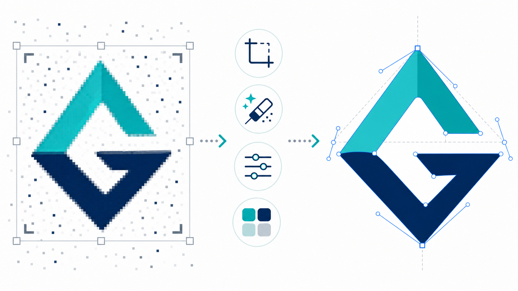
Use this fast rule before you convert: clean the source until the important shape is obvious at a glance. Crop it, remove the background, sharpen the contrast, reduce noise, and keep only details you would want to edit later.
What does it mean to prepare an image for SVG conversion?
Preparing an image for SVG conversion means editing the raster source so the converter can detect the intended shapes instead of tracing accidental pixels. The goal is not to make the image prettier. The goal is to make the subject, edges, colors, and background easier to interpret as vector geometry.
Image-to-SVG conversion is the process of turning a pixel-based image into scalable vector graphics made from paths, fills, strokes, and coordinates. MDN describes SVG as a vector image format for two-dimensional graphics, while the W3C SVG 2 specification defines the underlying XML-based graphics model. In practice, that means every extra pixel decision can become extra vector structure.
If you already have a clean logo, icon, badge, or sketch, start with Image to SVG. If your source is a real camera photo, read the focused photo to SVG converter guide first so you know whether to trace, simplify, or keep the image raster. If the output looks noisy, do the cleanup below before running another conversion.
If your only source is a screen capture, use the screenshot to SVG guide before converting. Screenshots need extra cropping and background cleanup because the converter will trace UI chrome, shadows, and tiny text if you leave them in the source.
What should you fix before converting an image to SVG?
Fix the background, crop, resolution, contrast, noise, and color complexity before converting an image to SVG. These six inputs decide whether the output becomes a clean editable vector or a technically valid SVG that is too messy to use.
Use this decision table before uploading:
| Source issue | What it does to SVG output | Fix before conversion |
|---|---|---|
| White or colored background | Creates background rectangles and extra paths | Remove it or make it transparent |
| Huge empty margins | Produces awkward bounds and viewBox cleanup work | Crop tightly around the artwork |
| Low resolution | Creates stair-step edges and lumpy curves | Use a larger source or upscale carefully |
| JPG compression | Turns edge artifacts into tiny shapes | Use the original PNG if available, or denoise first |
| Low contrast | Makes edges hard to detect | Increase contrast between subject and background |
| Too many near-identical colors | Bloats the SVG with fragments | Reduce colors before conversion |
| Shadows, glow, texture | Creates hundreds of decorative paths | Remove them unless they are essential |
Do not chase perfection. If the important shape is clear and the accidental pixels are gone, the converter has enough signal to work with.
Should you remove the background before image-to-SVG conversion?
Remove the background before image-to-SVG conversion when the final SVG should be transparent or when the background is not part of the design. Background cleanup is one of the highest-impact fixes because converters often trace backgrounds as real shapes.
This matters most for:
- logos on white squares
- product icons on colored tiles
- scanned sketches on paper
- screenshots with UI chrome around the actual mark
- JPG files with noisy background gradients
If the background is supposed to remain, keep it. A badge, label, or app icon may need its containing shape. But if you want a transparent SVG logo, a white square behind the logo is not harmless. It becomes something you have to delete later.
For alpha-specific cleanup, use the focused guide on transparent PNG to SVG conversion. It shows how to catch white matte pixels, checkerboard export mistakes, and edge halos before they become vector paths.
For an existing SVG that already has a background, use the specific cleanup guide: How to Make an SVG Background Transparent. For a raster image that has not been converted yet, clean the background before using Image to SVG.
How do you crop an image before SVG conversion?
Crop the image tightly enough that the artwork fills the canvas, but leave a small margin so strokes and shadows are not cut off. The converter should see the subject as the main signal, not a tiny object floating inside a large blank image.
Use this crop checklist:
- Remove website headers, screenshot borders, and surrounding UI.
- Keep only the logo, icon, sketch, label, or illustration you want to vectorize.
- Leave 2-5% visual padding around the artwork.
- Keep the canvas square only if the final use case needs a square icon.
- Avoid cropping through strokes, shadows, or rounded badge edges.
Cropping also helps the final SVG bounds. A badly cropped source can produce an SVG with a weird viewBox, too much whitespace, or a visible mark that appears off-center when embedded.
How do you improve contrast for cleaner vectorization?
Increase contrast so the converter can separate the subject from the background and distinguish real edges from soft pixel transitions. Better contrast usually means fewer accidental paths and cleaner curves after conversion.
Use contrast cleanup when:
- a dark logo sits on a gray background
- a scanned sketch has faint pencil lines
- a JPG has soft edges from compression
- a flat icon has colors that are too close together
- a badge has text that almost blends into the fill
For black-and-white art, push the file toward true black and true white before conversion. For multicolor art, avoid crushing everything into harsh colors; the goal is edge clarity, not destroying the design. If the source is a logo, stamp, signature, or line drawing, use the focused black and white image to SVG workflow before you trace it.
If the image is a PNG logo, the settings-focused guide explains the next step after cleanup: PNG to SVG Converter Settings.
How many colors should an image have before SVG conversion?
Use the fewest colors that preserve the design. Logos and UI icons usually convert best with a small color palette. Flat illustrations can use more colors. Photos and textured images usually should not be forced into SVG at all.
Here is the practical starting point:
| Image type | Good color target | Best SVG outcome |
|---|---|---|
| One-color icon | 1-2 colors | Simple paths, easy recoloring |
| Logo or wordmark | 2-8 colors | Clean brand shapes |
| Badge or sticker | 4-12 colors | Editable regions without too much noise |
| Flat illustration | 8-24 colors | More detail, still manageable |
| Photo or realistic render | Avoid tracing | Keep as JPG/WebP or recreate key shapes |
The problem is not color itself. The problem is near-duplicate colors around edges. A black logo exported with anti-aliasing may include many gray edge pixels. If each gray becomes a separate path, the SVG gets hard to edit for no useful reason.
When should you denoise or upscale before vectorizing an image?
Denoise when the source has speckles, JPG artifacts, scan dust, or textured background junk. Upscale only when the image is genuinely too small and the subject is still recognizable. Do not upscale a bad image and expect it to become a clean vector source.
Use denoising for:
- scanned sketches
- old logo JPGs
- images saved from messaging apps
- screenshots with compression artifacts
- marketplace graphics with noisy transparent edges
Use upscaling for:
- small but clear icons
- simple logos under roughly 300px wide
- sketches where the line direction is still obvious
Avoid upscaling for:
- blurry text
- photos
- tiny website footer logos
- low-quality screenshots where the original shape is unclear
If the source is so poor that you cannot tell where the edge should be, the converter cannot know either. At that point, recreation is faster than tracing.
Should you convert, trace manually, or recreate the SVG?
Convert the image when the source is already close to vector art. Trace manually when the source is simple but needs careful control. Recreate the SVG when the source is too small, blurry, photographic, or brand-critical enough that a rough trace would be embarrassing.
| Situation | Best move | Why |
|---|---|---|
| Clean PNG logo | Convert with Image to SVG | Fastest path to a usable vector |
| Old JPG logo with artifacts | Clean first, then convert | Removes junk before it becomes paths |
| Pencil sketch | Increase contrast, denoise, then convert | Preserves line intent |
| Screenshot of a logo | Recreate or find a better source | Screenshots usually trace poorly |
| Photo of a product | Keep raster or create a simplified illustration | Photos become bloated SVGs |
| Approved brand mark for print | Convert, inspect, then manually clean | Production files need stricter review |
The JPG to SVG conversion guide compares conversion methods in more detail. This page is the prep step before you choose the method.
What is the best workflow for preparing an image for SVG?
The best workflow is to clean the source, convert once, inspect the SVG, then adjust only the problem that appears. Do not keep changing every setting blindly. Diagnose the first output and fix the source or settings that caused the issue.
Use this workflow:
- Start with the highest-quality original image you can find.
- Crop the canvas around the actual artwork.
- Remove any background that should not appear in the final SVG.
- Increase contrast until the important edges are clear.
- Denoise speckles, compression artifacts, and scan dust.
- Simplify colors if the image has too many near-identical tones.
- Convert with Image to SVG.
- Inspect the result at small size and large size.
- Open the output in SVG Editor for cleanup.
- Minify or optimize the finished file only after the visual result is right.
If you are converting many private files or client assets, use a local batch workflow instead of repeatedly uploading one image at a time. The desktop raster-to-vector converter guide covers that production path.
Why does a cleaned image still produce a bad SVG?
A cleaned image can still produce a bad SVG when the source content is fundamentally raster-like. SVG is not a magic quality upgrade. It is excellent for shapes, outlines, flat colors, diagrams, logos, and icons. It is weak for continuous-tone photography, complex texture, and tiny raster text.
If the output still looks bad after cleanup, check these failure modes:
- The image is a photo, not vector-like artwork.
- Text was rasterized and should be rebuilt with a real font.
- The source is too small to infer clean curves.
- Shadows or gradients are carrying too much of the design.
- The output has a hidden embedded raster image instead of real paths.
- The design would be faster to recreate than to repair.
That last point is not defeat. It is the professional move. A clean recreated SVG often beats a technically converted SVG that nobody wants to edit.
If you already converted the file and the result has jagged edges, thousands of paths, warped text, or an unexpected background, use the troubleshooting guide to fix bad image-to-SVG conversion results before changing every setting again.
FAQ
How do I prepare an image for SVG conversion?
Prepare an image for SVG conversion by starting with the highest-resolution source, cropping excess whitespace, removing unwanted backgrounds, increasing edge contrast, reducing noise, and simplifying colors before you upload it to an image-to-SVG converter.
Should I remove the background before converting an image to SVG?
Yes, remove the background before SVG conversion when the background is not part of the final design. Otherwise the converter may trace the background as real vector shapes, which creates extra paths, white boxes, speckles, and harder editing.
Why does my image-to-SVG conversion look messy?
Image-to-SVG conversion looks messy when the source image has compression artifacts, shadows, texture, low resolution, fuzzy edges, too many colors, or an unwanted background. Clean the source first, then convert with conservative settings.
Can I convert a photo to SVG?
You can convert a photo to SVG, but it is usually the wrong move. Photos often become huge, slow SVG files with thousands of paths. SVG conversion works best for logos, icons, badges, diagrams, sketches, and flat illustrations.
What is the fastest way to get a cleaner SVG?
The fastest way to get a cleaner SVG is to remove the background, crop tightly, and convert a higher-resolution source. Those three fixes usually improve output more than switching between random converters.
Bottom line
Clean input creates cleaner vectors. Before you blame the converter, remove the background, crop the subject, improve contrast, reduce noise, and simplify colors. Then run the image through Image to SVG and inspect the output in SVG Editor.
If the image is logo-like, icon-like, or illustration-like, preparation can make the difference between a messy trace and a usable SVG. If the image is photographic or too damaged, recreate the vector instead of forcing a bad conversion.
Create your own SVG graphics with AI
Describe what you need, get a production-ready vector in seconds. No design skills required.
About This Article
This article was written by SVG Genie Team based on hands-on testing with SVG Genie's tools and years of experience in vector design and web graphics. All recommendations reflect real-world usage and are reviewed by the SVG Genie editorial team for accuracy.
About the Author
SVG Genie Team
SVG Design Expert & Technical Writer at SVG Genie
SVG Genie Team is a vector design specialist and technical writer at SVG Genie with years of hands-on experience in SVG tooling, AI-assisted design workflows, and web graphics optimization. Their work focuses on making professional vector design accessible to everyone.
More articles by SVG Genie Teamarrow_forward